System & Structure: A brand that holds together
You can have a strong logo, considered typography, and a clear colour palette—and still feel inconsistent.
That’s because identity elements define what a brand is, not how it behaves.
System and structure—grid, layout, and graphic devices—are what coordinate those elements in the real world. They turn assets into behaviour. They reduce friction, build recognition, and allow brands to scale without drifting.
This chapter explains why brands fall apart even when the pieces are right, and how structure is the missing layer that makes everything hold together.
Why everything looks right, yet still falls apart
If you’ve worked through the first parts of this series, you’ve likely felt a familiar tension.
You have a logo that makes sense. Your typography feels considered. Your colour palette is intentional. And yet. Somehow, the brand still feels inconsistent. Not obviously broken. Just… unsettled.
Things look right in isolation, but when you step back, something doesn’t hold. A website page feels disconnected from a presentation. A campaign doesn’t quite resemble the last one. Social posts feel loosely related, not clearly part of the same whole.
This is the moment most brand owners blame execution. They assume the issue is taste. Or discipline. Or “making sure people follow the brand.” In reality, something more fundamental is missing.
Logo, typography, and colour are not enough on their own. They define what a brand is. They do not define how it behaves. That role belongs to system and structure.
Chapter One
The problem isn’t inconsistency. It’s coordination.
Brands are not experienced as individual assets. They are experienced as a sequence of encounters that accumulate into a feeling.
Every touchpoint adds to that mental picture, whether it is a website, a slide deck, a social post, or a campaign visual. When those encounters don’t relate to each other clearly, the brand begins to feel improvised. Not chaotic. Just unresolved.
This is where many brands get stuck. They attempt to fix inconsistency by tightening control over individual elements, using the logo more strictly, policing typography, restricting colour usage. These efforts help, but they rarely solve the root problem.
Because the issue isn’t the elements themselves.
It’s how they interact.
Before a word is read or a message is processed, design has already communicated something. Layout, spacing, hierarchy, and repetition all shape perception instantly and subconsciously. Viewers don’t analyse this structure, but they respond to it. They sense whether something feels deliberate or accidental.
What governs this sense of deliberateness is not taste or instinct, but grid. Grid is the invisible framework that coordinates space, alignment, and hierarchy across layouts. It is what allows typography, colour, imagery, and graphic devices to relate to one another predictably.
Without a grid, design decisions are made locally. With a grid, they compound globally.
When structure is missing, identity elements float. They appear, but they don’t compound. This is why brands can feel inconsistent even when all the “right pieces” are in place.
Consistency is often mistaken for sameness. Coordination is something else entirely. Consistency enforces repetition. Coordination allows difference to relate.
Brands that rely only on assets chase consistency. Brands that rely on systems achieve coordination.
Visual case study: Mastercard
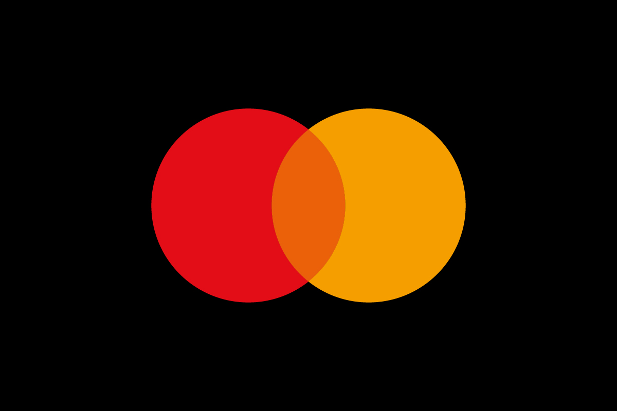
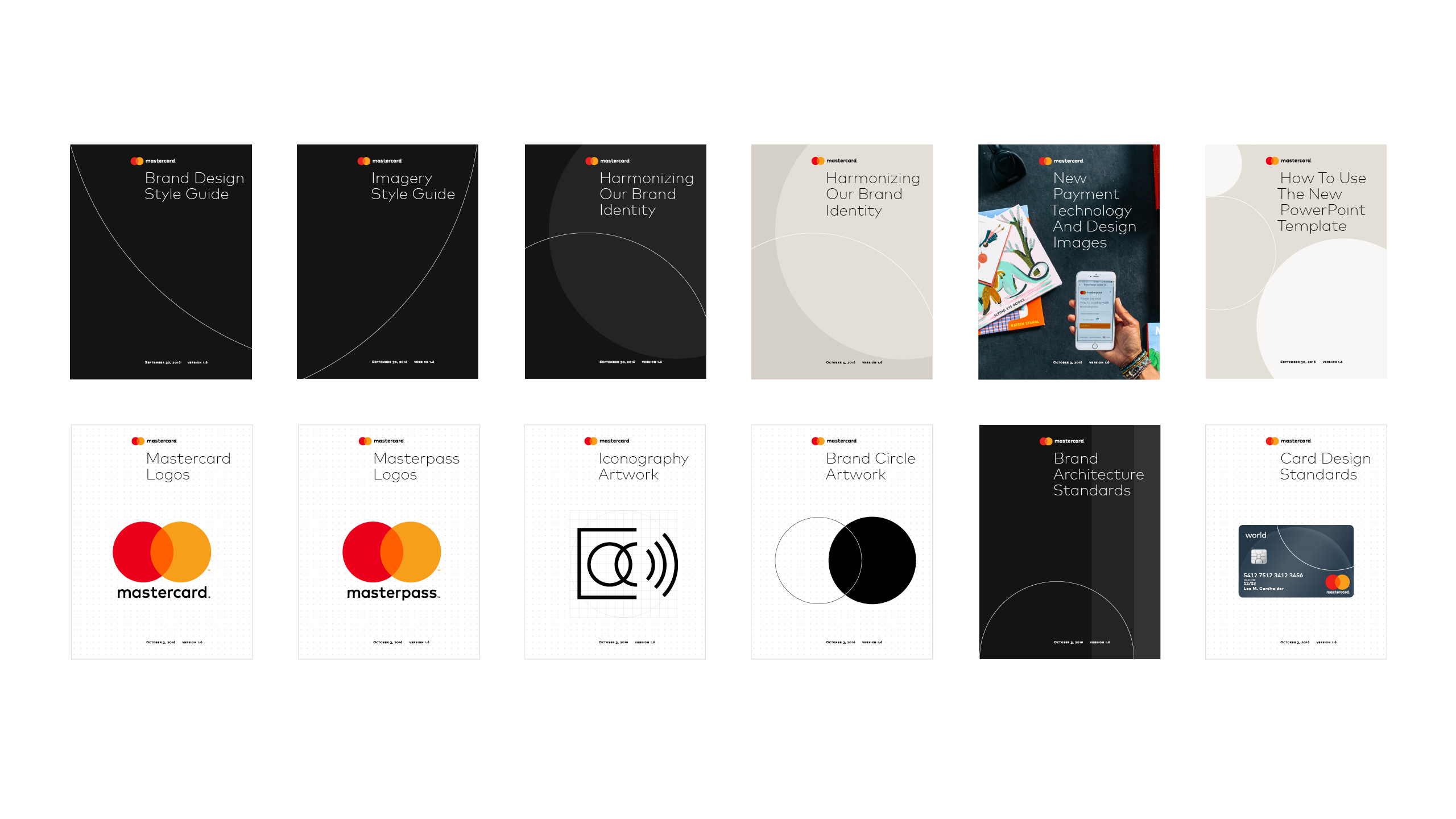
Mastercard’s modern brand demonstrates what coordination looks like when it works. The logo, typography, and colour system are all present, but none of them lead on their own. What holds everything together is structure.
A consistent grid governs space. Layout rules control hierarchy. Graphic devices—most notably the circle system—create repetition without monotony.
The circle system works because it operates within that grid. Geometry alone does not create order. Structure does. The grid determines where circles appear, how they scale, and how they relate to typography and content.
Even when the logo disappears, the brand remains recognisable because its behaviour stays the same.
What Mastercard shows is subtle but critical: consistency does not come from enforcing assets. It comes from coordinating them.
Chapter Two
Why structure is felt before it is understood
One of the reasons structure is often overlooked is that it operates below the level of conscious attention. People don’t point at a layout and say, “This grid is good.” They simply feel that something is clear, calm, or trustworthy.
Structure works because it reduces cognitive effort.
This idea is not new. In 'Grid Systems in Graphic Design', Josef Müller-Brockmann described the grid as a rational framework for organising content so that clarity, order, and coherence emerge naturally. The grid was never meant to be seen. It was meant to be felt, in the ease of reading, the calm of composition, and the absence of friction.

Modern brand systems inherit this logic, even when they no longer reference it explicitly.
When hierarchy is predictable, information is easier to process. When spacing is consistent, the eye moves without friction. When layouts repeat with variation, recognition builds quietly over time. This is not aesthetic preference. It is behavioural psychology.
Brands that lack structural consistency ask more of their audience. Each new encounter requires relearning. Each new execution introduces small moments of uncertainty. Over time, this friction erodes trust, even if the product or service is strong.
This is why system and structure belong in the MVB framework. They are not about decoration. They are about reducing effort, both for the audience and for the teams producing the work.
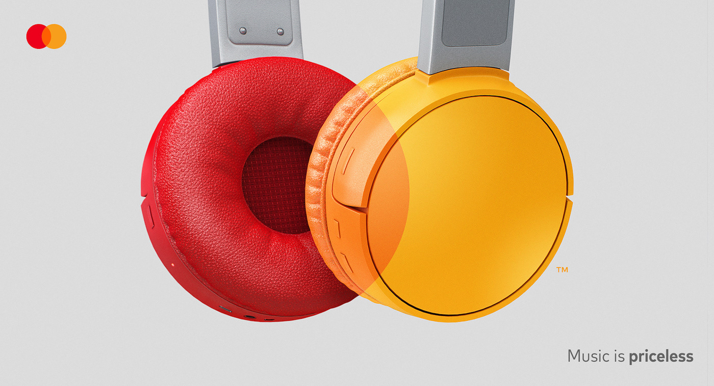
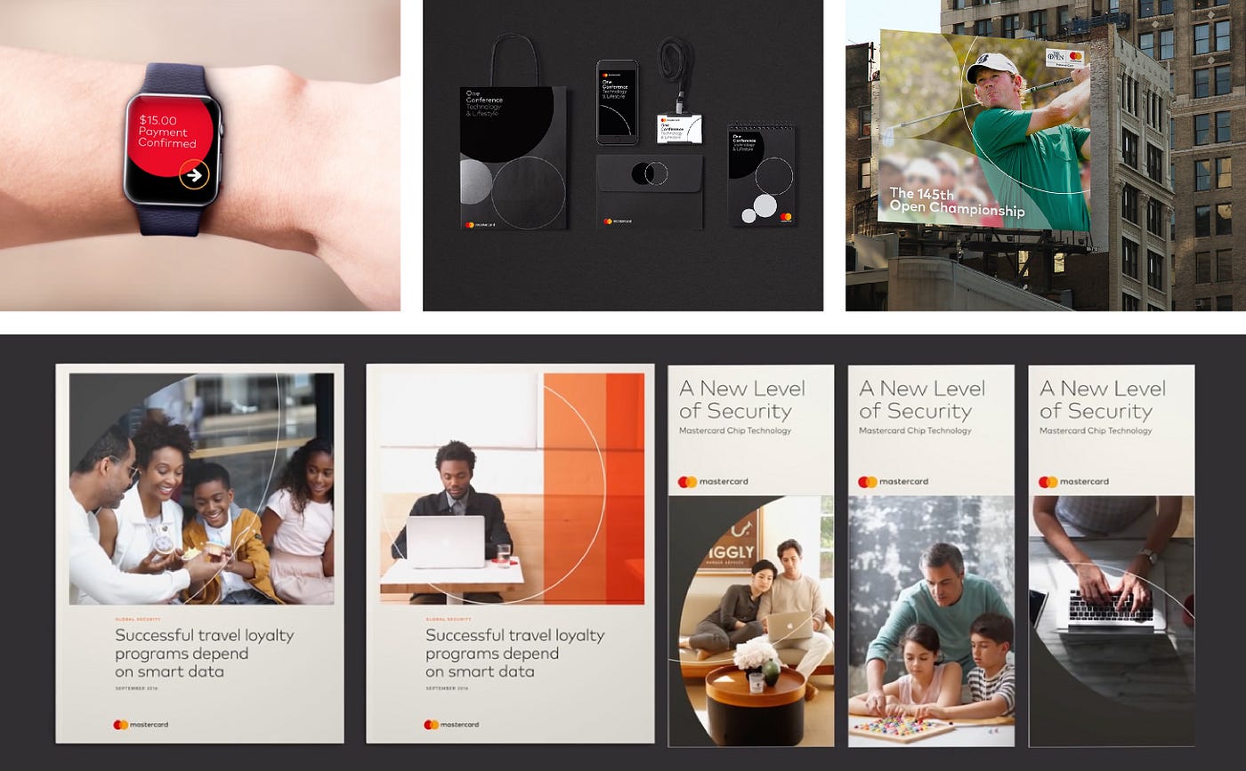
Returning to Mastercard
Across campaigns and contexts, Mastercard allows expression to change while behaviour stays constant. Colour shifts. Imagery evolves. Tone adapts. But spacing, hierarchy, and layout logic remain recognisable.
Typography and colour are not constrained by the system; they are supported by it. The system absorbs variation without fragmentation. What looks like creative freedom on the surface is actually the result of strong underlying discipline.
This is the point many brands miss: without structure, creativity creates noise. With structure, creativity creates voice.
Think about your last five brand executions.
Website. Deck. Social. Email. Proposal.
Do they feel like they came from the same place? Or do they feel loosely related — right pieces, wrong coordination?
If it's the latter, the issue isn't execution. It's structure. And structure is exactly what a Vision Clarity Session diagnoses.
Book a Free Vision Clarity Session →
Chapter Three
When brands grow, structure becomes leadership
As brands scale, design stops being an occasional task and becomes an operational reality. New materials are created constantly, often by different teams, partners, or regions. At this stage, relying on individual judgement becomes risky.
Not because people lack skill. Because coordination breaks down. This is where system thinking shifts from being a design concern to a leadership concern. The role of the brand owner changes from approving outputs to defining the rules that govern them.
In the MVB framework, grid is not a design choice. It is a leadership decision about how order is created and maintained at scale. Grid, layout, and graphic devices become governance tools. They replace subjective debate with shared understanding. They allow teams to move faster without losing coherence.
Visual case study: Lufthansa
LINK: Lufthansa Brand Identity System
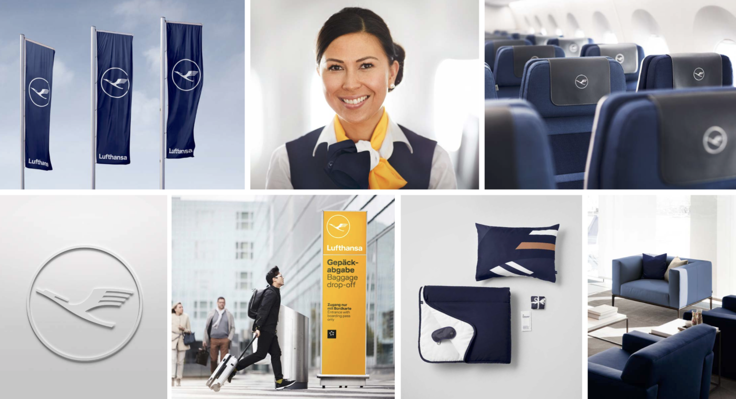

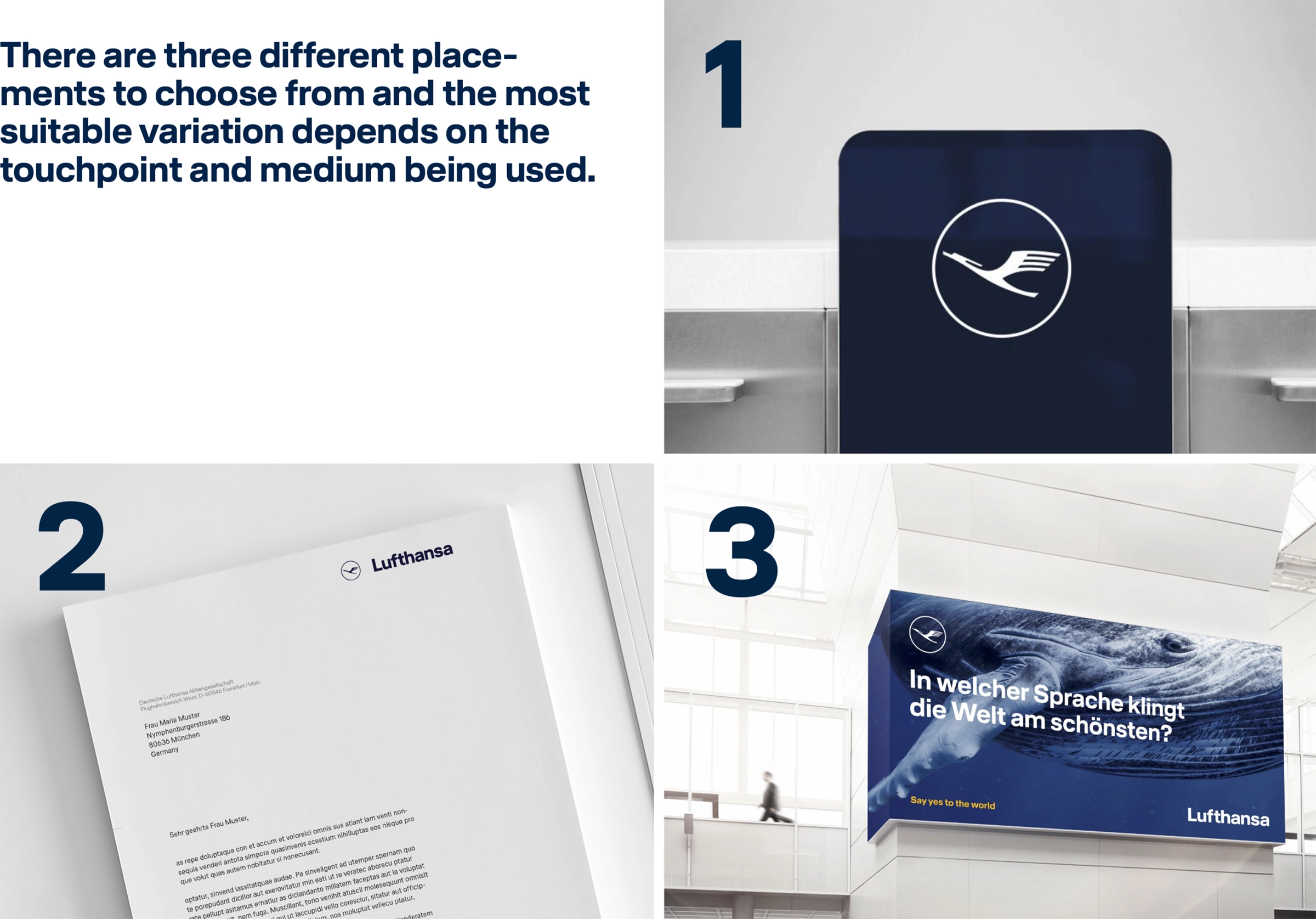
Lufthansa is a clear example of structure used as leadership. Its brand system is built on disciplined grids, precise typography, and strict layout logic applied across an enormous range of environments, from airports and aircraft to print, digital, and safety communication.
Typography and colour are present, but never dominant. They operate within a rigid structural framework designed for clarity and reliability. This restraint is not aesthetic minimalism; it is operational intelligence.
Thousands of contributors work within the same system without diluting the brand. The structure does the coordinating. Design becomes scalable because behaviour is defined.
Chapter Four
When the MVB starts to compound
At a certain point, design stops being something you manage and starts being something that works for you. The logo is clear. Typography is disciplined. Colour is recognisable. Structure holds everything together.
From here, brands behave differently. They don’t rely on constant explanation. They don’t need to reinvent themselves to stay relevant. They feel stable, even as they evolve. This is when the MVB becomes a strategic advantage.
Brands without structure expend effort repeatedly. Brands with structure build momentum. Each execution reinforces the next. Recognition compounds. Trust accumulates quietly.
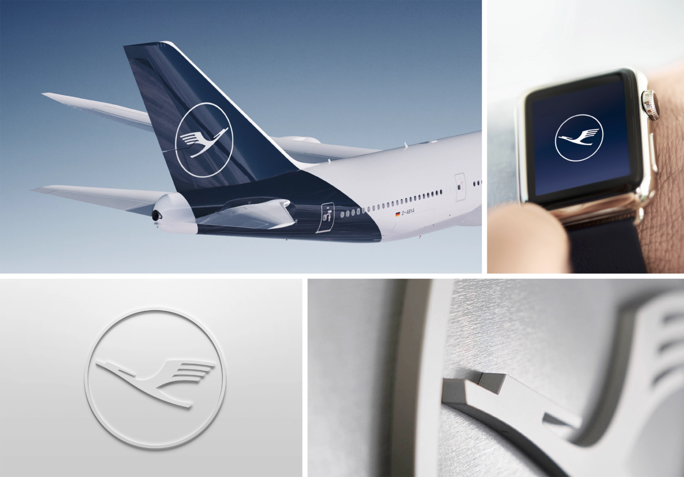
Returning to Lufthansa
Lufthansa’s system has evolved over decades without resetting itself. Refinement replaces reinvention. Structure carries meaning forward, reinforcing reliability in an industry where trust is non-negotiable.
This is design as infrastructure. Not ornament. Not expression for its own sake. A system that allows identity to endure under pressure.
Design that holds (and what comes next)
Logo identifies. Typography speaks. Colour signals. But without system and structure, they remain parts.
Grid, layout, and graphic devices turn identity into behaviour. They make the brand repeatable, scalable, and recognisable in the real world.
In the MVB series, this is the chapter where everything locks together. Where the brand stops being a collection of assets and starts acting like a system.
If this article made you think about your own brand, that's worth a conversation.
Book a Free Vision Clarity Session →


