The Key Visual: The architecture of recognition.
Logos identify; Key Visuals imprint.
While the logo confirms who is speaking, the Key Visual ensures the audience knows the speaker at a glance.
Recognition is built through patterns. In a scrolling economy, brands are perceived before they are read. If recognition isn't instant, you've lost cognitive ground. Infrastructure over decoration.
A Key Visual is the bridge between high-level positioning and ground-level perception. The "Entropy" Tax. Visual inconsistency is a tax on your growth.
Changing styles frequently forces the brand to "reintroduce" itself every time, wasting capital and attention.
Introduction: The structural flaw in modern branding
There is a structural flaw in how most brands approach visuals. The assumption is usually the same: once a logo is designed and a colour palette is chosen, the visual layer is complete. It’s an understandable mistake. Logos feel official. They signal legitimacy. They provide the "stamp" of authorship. But they are not, on their own, sufficient to build recognition in modern, high-velocity markets.
In digital environments where audiences scroll past hundreds of stimuli per hour, brands are not read first. They are perceived.
Recognition happens before comprehension. By the time a customer has read your name or processed your logo, their brain has already decided whether to engage or ignore. If that recognition does not occur instantly—without effort—the brand has already lost the battle for the millisecond. This is where the Key Visual becomes essential.
The Key Visual is the repeatable visual construct that allows a brand to be recognized before its name is processed. It is the image architecture that carries positioning into perception.
It is not a campaign idea, not a seasonal aesthetic, and not a design flourish. It is the most consistent visual expression of the brand’s core idea—engineered for repetition and deployed with discipline. Without it, every communication begins from zero. With it, every communication compounds.
Chapter 1:
The anatomy of an imprint
To understand the Key Visual, we must first separate it from the logo.
A logo is a signature; it answers the question: “Who is this?”
A Key Visual is a pattern; it answers the question: “Have I seen this before?”
The difference is the difference between reading and remembering. A Key Visual is a repeatable visual system anchored in a single dominant idea. It is the "connective tissue" that makes a billboard, an Instagram ad, and a product package feel like they share the same DNA, even if the logo is missing.
The five archetypes of the key visual
A functional Key Visual usually manifests in one of five structural forms:
01. The Product Action (The Ritual)
A functional Key Visual often captures the product in motion—freezing the exact moment of use until it becomes a permanent mental imprint. It is the visual shorthand for the brand’s physical experience.
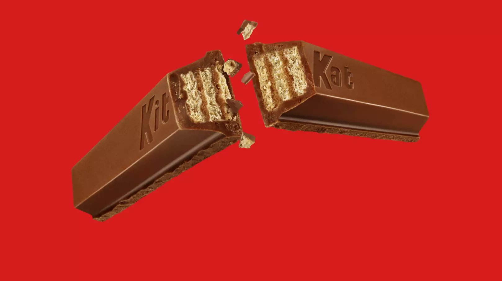
The KitKat Snap:
The mid-air fracture of the chocolate wafer, capturing the tactile "break" that has become synonymous with the brand’s identity.
The Perrier Mist:
The explosive, hyper-chilled condensation and spray that signals intense carbonation and refreshment before the bottle is even opened.

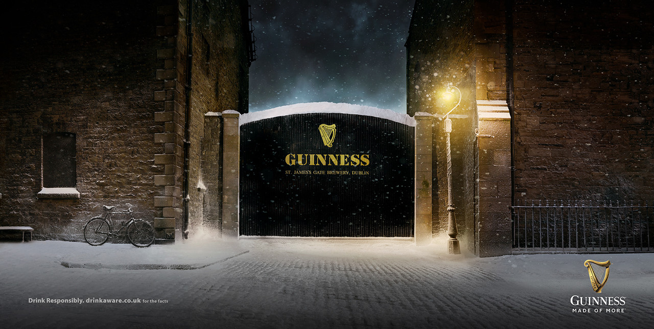
The Guinness Surge:
The atmospheric "settle" of the pour against a dark, moody backdrop, transforming the slow movement of the liquid into a disciplined ritual of anticipation.
The Lesson: Don’t just show the product. Show the action that belongs to you and you alone.
02: The Proprietary Environment:
This is not merely a hex code or a decorative motif. It is the disciplined application of a visual "flood" that takes over a space, creating a specific psychological environment before the product is even identified. When a visual environment is systemized, it reduces the cognitive effort required for the audience to find you in a noisy category.
-
- Hermès (Orange):
Floods packaging and event spaces with a specific, high-energy orange to signal luxury and heritage. By saturating their physical touchpoints with this singular hue, they ensure the brand is recognized across a crowded street without the need for a logo.

-
- Burberry (The Check):
This is the gold standard for Pattern as Infrastructure. The camel, black, red, and white check is a structural asset so distinct that it can be stripped of the logo or blurred, and the brain still decodes "Burberry" instantly. It turns every coat lining into a silent, recognizable advertisement.

-
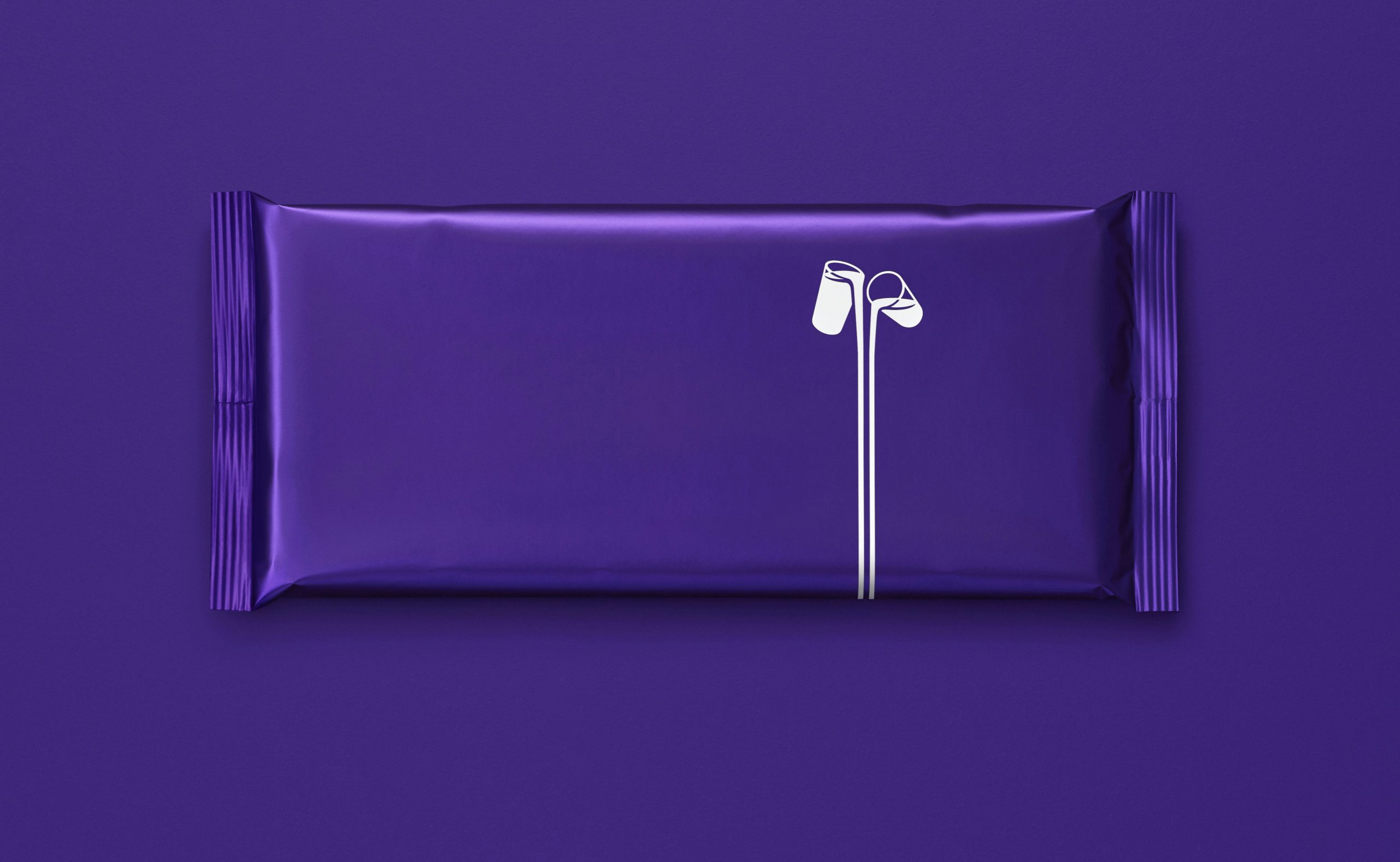
- Cadbury (Purple):
Cadbury owns a specific shade of royal purple (Pantone 2685C) that has become the definitive shorthand for the chocolate category. The colour is so ingrained in the consumer’s subconscious that it functions as a visual Pavlovian trigger; the flood of purple signals "Cadbury" and "Creamy" before the font or the "Glass and a Half" logo is ever processed.
The Lesson: Own a wavelength or a geometry, then deploy it with total discipline. When the environment is clear, the brand is perceived before it is read.
03. The Structural Silhouette (Form as Canvas)
When the shape itself is the asset, it becomes a "visual container" that can hold endless creative variations. In this archetype, the silhouette provides the infrastructure, while the creative content becomes the occupant. This allows a brand to be infinitely flexible across campaigns while remaining 100% recognizable from a distance.
The Absolut Bottle:
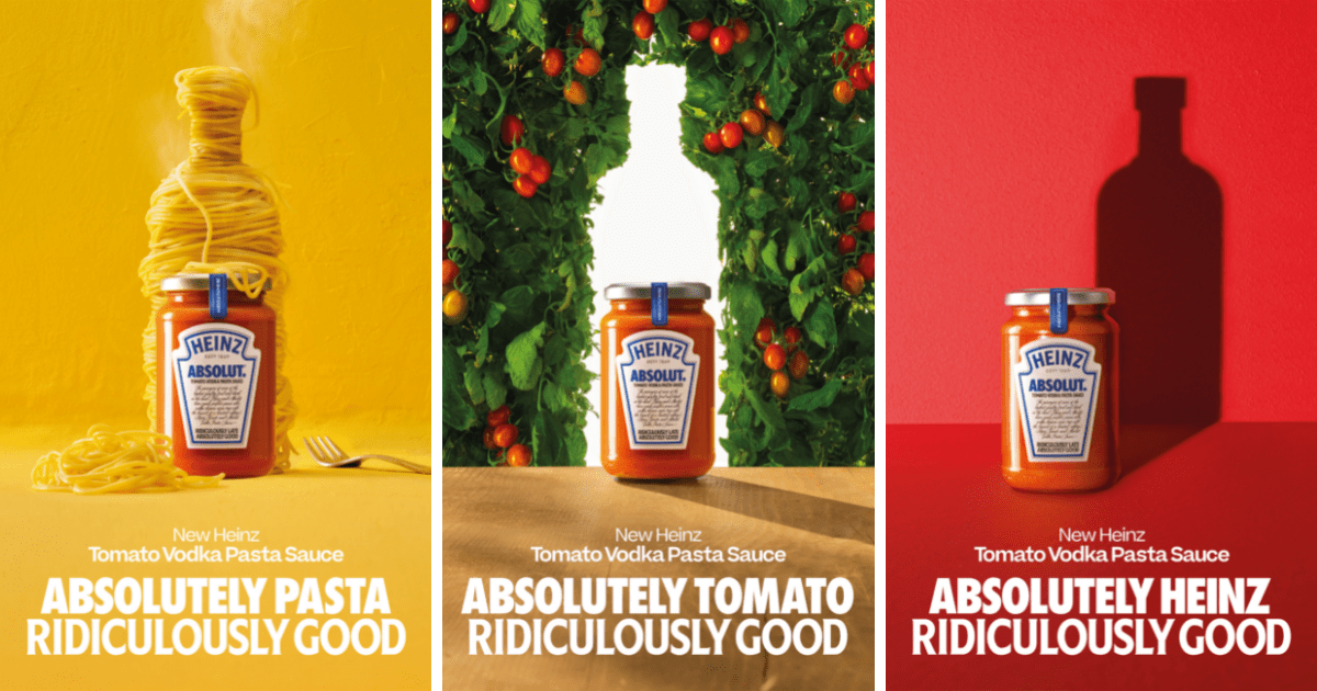
- For decades, Absolut built a global identity through the consistent silhouette of its medicinal-style bottle. Whether the bottle was made of city lights, fruit, or artistic brushstrokes, the structural outline remained constant. That silhouette became a visual anchor that allowed for radical creative experimentation without ever sacrificing brand recognition.
The Coca-Cola Contour:

- The "Hobbleskirt" bottle is so distinct that the original brief in 1915 demanded a shape that could be recognized "even if broken on the ground or felt in the dark". This silhouette is so potent that the brand can remove its logo entirely and simply use the red-and-white ribbon on the curved glass form to signal its presence.
The Pringles Hyperbolic Paraboloid:

In a category defined by the random, jagged edges of fried potatoes, Pringles owns the perfect mathematical curve. The "saddle" shape of the chip is a structural asset that signals precision, stackability, and engineered consistency. By isolating this specific geometry in their visuals, Pringles ensures the brand is perceived through form alone, long before a customer reads the packaging.
The Lesson: When your structure is stable, your creativity can be fluid. A strong silhouette creates a "safe zone" for innovation, ensuring that no matter how much the message changes, the source remains unquestionable.
04. The Compositional Logic (The Framing Rule)
Some brands "own" a specific way of viewing and framing the world. This isn't just a layout choice; it is a "window" through which the audience is forced to experience the brand's content. When the logic of the frame is consistent, the brand can change the subject matter entirely while maintaining instant recognition.
National Geographic (The Portal):

For over a century, the simple yellow rectangular border has served as more than a logo—it is a literal and figurative portal to the world. This frame is so iconic that any image placed within it is immediately perceived through the lens of exploration, authority, and high-stakes photography, even without the wordmark.
Apple (The Infinite Void):

Apple owns the "infinite white" void and a specific, hyper-symmetrical compositional logic. By placing products in a vast, uncluttered space with clinical lighting, they signal a posture of absolute certainty and design leadership. The negative space is not empty; it is a structural asset that filters out the noise of the category.
Polaroid (The White Border):

Polaroid owns a specific compositional ratio—the wide bottom white margin that surrounds a square image. This framing rule is so powerful that it signals "nostalgia" and "instant memory" regardless of the subject matter inside the frame. The white border acts as the infrastructure of the brand, turning any digital or physical photo into a recognizable "Polaroid" before the viewer ever looks for a logo.
The Lesson: Consistency in framing creates an immediate sense of origin. By defining the "rules" of your window, you ensure the audience recognizes the speaker before they ever process the subject.
05. The Material Texture (The Sensory Cue)
Material texture is the most visceral archetype of the Key Visual. It moves recognition from the eyes to the skin, using tactile cues to trigger sensory memory. When a brand owns a texture, it bypasses the logical brain and signals origin through a gut-level, physical response.
The Heinz Viscosity:
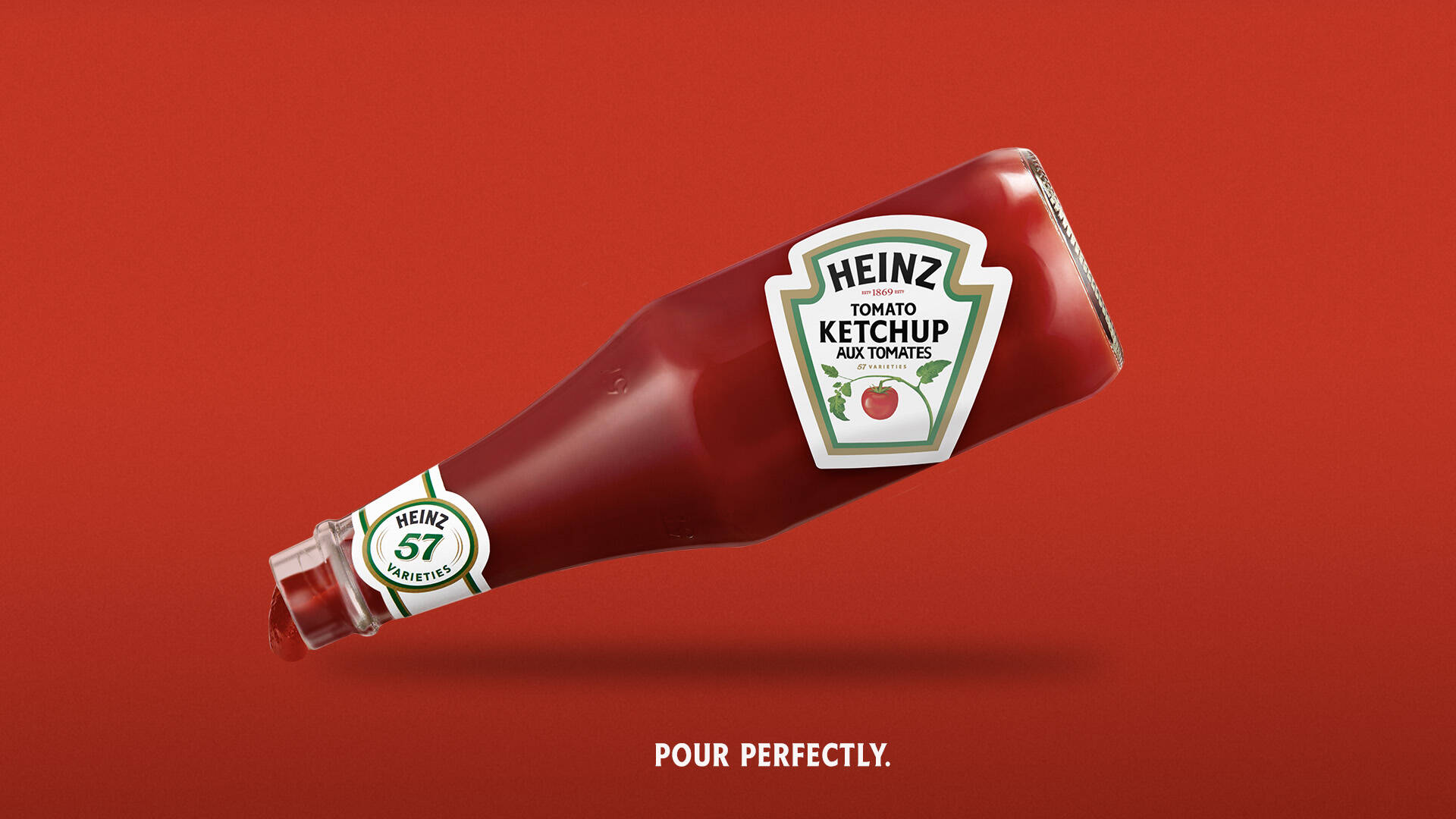
- The defining signature is the slow, dense pour—that suspended ribbon of ketchup that appears almost reluctant to leave the bottle. This specific texture communicates thickness, which signals quality and authenticity. Even with a blurred label, the product's "behavior" tells you exactly who is speaking.
The Rolls-Royce Starlight:
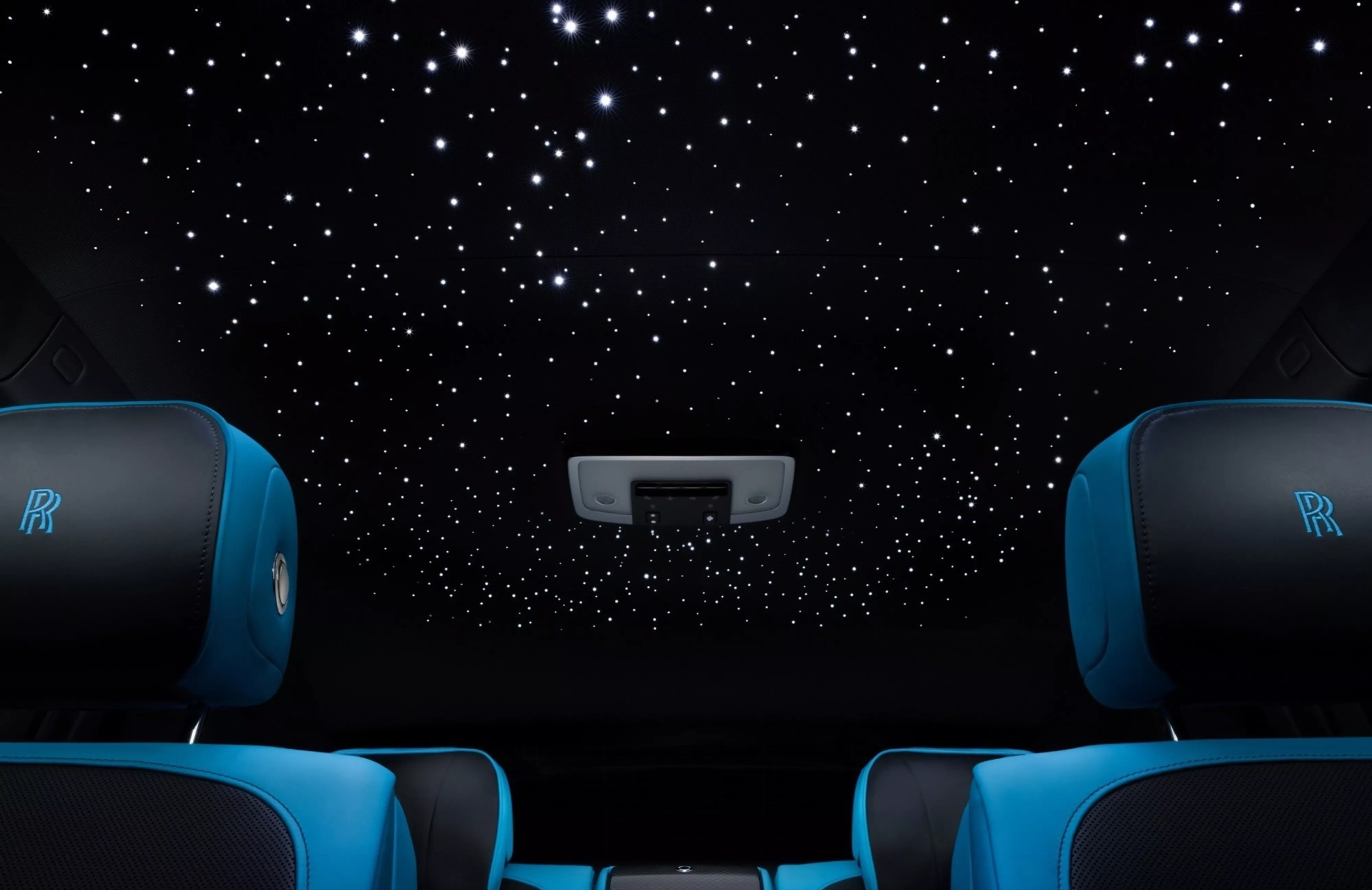
- Beyond the leather and wood, Rolls-Royce owns the texture of the "Starlight Headliner"—thousands of fiber-optic lights woven into the roof lining. This luminous, celestial texture has become a proprietary sensory environment that signals a specific level of bespoke permanence. It is a material shorthand for a cabin experience that no other automotive brand can claim.
The Chanel Tweed:

In luxury fashion, Chanel owns the tactile "nubby" texture of bouclé tweed. This material is so synonymous with the house that the fabric itself—regardless of the garment's cut—signals the brand's heritage of effortless elegance. The texture acts as a silent identifier that works even when the interlocking "C" logo is absent.
The Lesson: Recognition isn't just visual; it’s felt. Use texture to turn an abstract positioning idea into a physical truth. When your brand has a tactile signature, it becomes inseparable from the user’s sensory memory.
The "Squint Test" for Infrastructure
If you want to know if you have a Key Visual, you must subject your brand to the Squint Test. Look at your marketing material and squint until the words and logos are unreadable. If the page still looks like your brand, if the colour, the layout, and the "vibe" are unmistakable, you have a Key Visual.
If you look like every other B2B SaaS company or lifestyle brand in your category, you don't have a visual system; you just have a logo on a generic background.
Run the Squint Test on your own brand right now.
Blur your eyes. Look at your last five social posts, your website, your deck. If the visual language shifts — if it doesn't read as unmistakably yours without the logo — you don't have a Key Visual. You have a style that changes with whoever was briefing that week.
That's not a design problem. It's a system problem. And it's exactly what a Vision Clarity Session surfaces.
Book a Free Vision Clarity Session →
Chapter 2:
The psychology of cognitive ease
Why do we invest so much energy into a "repeatable pattern"? Because memory is not built through novelty. It is built through repetition within a stable visual frame.
1. The mere exposure effect
In behavioural science, the "Mere exposure effect" proves that people develop a preference for things merely because they are familiar with them.
In a market flooded with choice, familiarity is a proxy for safety. When a brand’s visual language is consistent, the audience’s brain encodes that pattern. The next time they see it, their brain processes it faster. This is called Cognitive Ease.
Cognitive ease feels like trust. Conversely, Cognitive Strain—the effort required to figure out who is talking to you—feels like suspicion. If your brand looks different every time you post, you are inadvertently triggering suspicion.
2. The "Entropy Tax" on growth
In early-stage companies, visual inconsistency is often mistaken for creativity. Founders and marketing teams get bored with their look and start "experimenting." This creates Brand Entropy.
When you change your photographic style or your layout logic every quarter, you are forcing the market to "relearn" your brand.
If you have a budget for 1,000 impressions but use five different visual styles, you haven't bought 1,000 units of awareness. You’ve bought 200 units of awareness, five times over. You are paying a tax on your own growth by wasting the cumulative power of repetition.
3. Operational efficiency
A Key Visual isn't just for the customer; it's for the team. Without a stable visual anchor, every design project starts from a blank canvas. This leads to long feedback loops, subjective "I don't like this" critiques, and friction between agencies and founders.
A Key Visual provides a Decision Framework. It turns a subjective debate into an objective check: "Does this follow our visual architecture?"
Chapter 3:
Engineering the asset
A Key Visual does not appear by accident. It is not the result of a "brainstorming" session. It is engineered through strategic derivation. It is the result of taking your Positioning and translating it into Perception.
Step 1: Isolate the strategic truth
The process begins with positioning. What is the core idea the brand stands for?
- If your positioning is "Precision," your Key Visual should be a masterclass in grid-based alignment and surgical sharpness. If your positioning is "Rebellion," your Key Visual might be a consistent "glitch" aesthetic or a raw, unpolished photographic style.
Without strategic clarity, visual development is just decorative experimentation. You must know what the visual is supposed to signal before you decide how it should look.
Step 2: Translate to image architecture
Once the strategic truth is defined, you must find its visual equivalent. This is where you move from adjectives to assets.
The "How":
How do we frame our product?
The "What":
What elements are present in every single shot?
The "Where":
Where does the eye go first?
For example, if you are a high-end skincare brand focusing on "Science," your Key Visual might be the consistent use of lab-grade macro photography and a "clinical white" lighting environment. This isn't just a style; it's a rule.
Step 3: Test for independence
Remove the logo. Remove the product name. Show the visual to someone who knows the category. If they can guess it’s you, you have a winner. If they guess three of your competitors first, your visual is "category-standard," not "brand-distinctive."
A Key Visual must be Own-able. It must be a territory that you can defend.
Step 4: Codify and govern
The final, and most difficult, step is discipline. You must document the Key Visual in a way that is instructional, not just inspirational.
- Do/Don't Charts:
Show the visual applied correctly and incorrectly.
- The Constraints:
Define the margins, the lighting ratios, and the "banned" visual tropes.
- The Multiplier Effect:
Ensure the Key Visual works on a 16:9 billboard and a 9:16 mobile ad.
The discipline lies not in inventing something clever for every new campaign, but in having the restraint to stick to the architecture you’ve built.
Logos identify. Key Visuals imprint.
The logo is the "Who." The Key Visual is the "What" and the "How." When visual repetition is intentional and sustained, brand equity accumulates. When visual language shifts continuously, equity dissipates.
The Key Visual is the mechanism through which meaning becomes memory. In brand systems built to scale, infrastructure precedes amplification. You cannot pour millions of dollars into a leaky bucket of inconsistent visuals and expect to build a dominant brand.
The Key Visual is that infrastructure. It works quietly in the background—building familiarity, reinforcing trust, and making future decisions easier for your customer.
If this article made you think about your own brand, that's worth a conversation.
Book a Free Vision Clarity Session →


