Typography: The voice you can see
Typography is the silent force behind strong brands. It shapes emotion, guides clarity, builds recognition, improves usability, and elevates perceived value.
— A well-built typography system ensures consistency, reduces design chaos, and scales with your brand as you grow.
— Invest in type, it pays off everywhere your brand speaks.
Typography 101 for branding projects
Why typography is the silent force behind clarity, consistency, and brand trust
Typography is one of the most visible and misunderstood components of branding. While logos, colors, and imagery often get the spotlight, typography carries the daily workload of communication. Every website, social media post, package, menu, presentation, ad, and internal document relies on type to guide attention and convey meaning. Typography shapes how audiences feel about a brand long before they consciously register the words on the screen.
To treat typography as a mere aesthetic preference is to miss its strategic power. Typography influences perception, clarity, usability, trust, and long-term brand recognition. It is the foundation on which consistent, high-performing brand communication is built.
This article breaks typography down into four parts, revealing why it matters, how it works, and how investing in it pays off — creatively, strategically, and operationally.
→ Top 5 Typography Rebrands of 2025
01 —
Typography as the silent force of branding
Typography is one of the most influential yet underestimated elements of brand identity. It operates quietly in the background, shaping how audiences perceive your brand long before they read a single sentence. While logos often receive the most attention, typography is the element people interact with most. Every brand touchpoint, from websites to emails to print, relies on typography to communicate clearly, consistently, and credibly.
To understand typography’s importance, it helps to view it not as a decorative choice but as a core strategic tool. Typography determines the tone, clarity, and emotional resonance of your brand’s communication. When chosen thoughtfully and applied consistently, it strengthens recognition, builds credibility, and enhances user experience. When neglected, it creates confusion, weakens brand presence, and undermines even the strongest visual identity.
Typography is not merely what words look like. It is how brands sound, behave, and are remembered.
Typography as a vehicle for emotion and personality
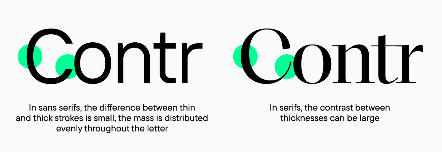
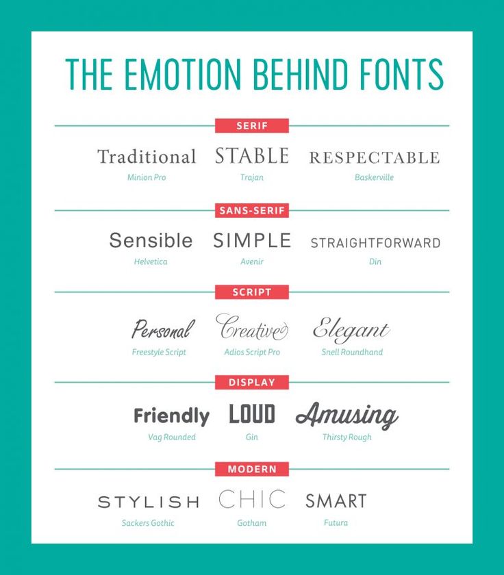
Every typeface carries a set of emotional cues. Serif typefaces often convey heritage, tradition, and authority. Humanist sans serifs communicate warmth, clarity, and approachability. Geometric typefaces create impressions of modernity, precision, and rationality. Display typefaces can offer character, energy, or uniqueness but can also polarize if misapplied.
These cues operate on a subconscious level. Viewers may not be able to articulate why a brand feels trustworthy, sophisticated, or playful, but typography plays a large part in that evaluation. The emotional tone of your brand begins long before the content itself is processed. Typography sets expectations. It frames how your audience interprets your message. A mismatch between typography and brand personality creates cognitive dissonance, making the brand feel inconsistent or inauthentic.
Because first impressions happen in seconds, typography becomes one of the fastest ways to communicate who you are. A strong typographic voice reinforces the emotional identity of the brand. A weak one compromises it.
Minimum Viable Brand: The System Behind This Article
This article sits within the Minimum Viable Brand (MVB) framework, a system designed to help brands establish clarity early and maintain coherence as they grow. The full MVB overview explains how strategy and identity work together as a single operating system.
Read the full Minimum Viable Brand overview and explore the complete series →
Typography as a tool for clarity and communication
Beyond emotion, typography plays a crucial role in comprehension. Good typography does not call attention to itself; instead, it enables smooth, effortless reading. Hierarchy guides the eye from the most important information to the least. Order, spacing, and alignment reduce cognitive strain. The right letterforms at the right sizes make long passages of text easier to navigate, especially in digital environments.
Poor typography creates friction. It forces the user to work harder to understand what they are reading. Misaligned type, inconsistent weights, cramped spacing, and excessive stylistic choices disrupt flow and dilute the message. In a world where attention spans are increasingly strained, any barrier to comprehension becomes costly.
This is especially important for digital-first brands, where users often skim rather than read in detail. Typography becomes the quiet architecture that directs how information is absorbed. Effective hierarchy increases engagement. Clear spacing increases retention. Good typography is invisible, yet its impact is tangible.
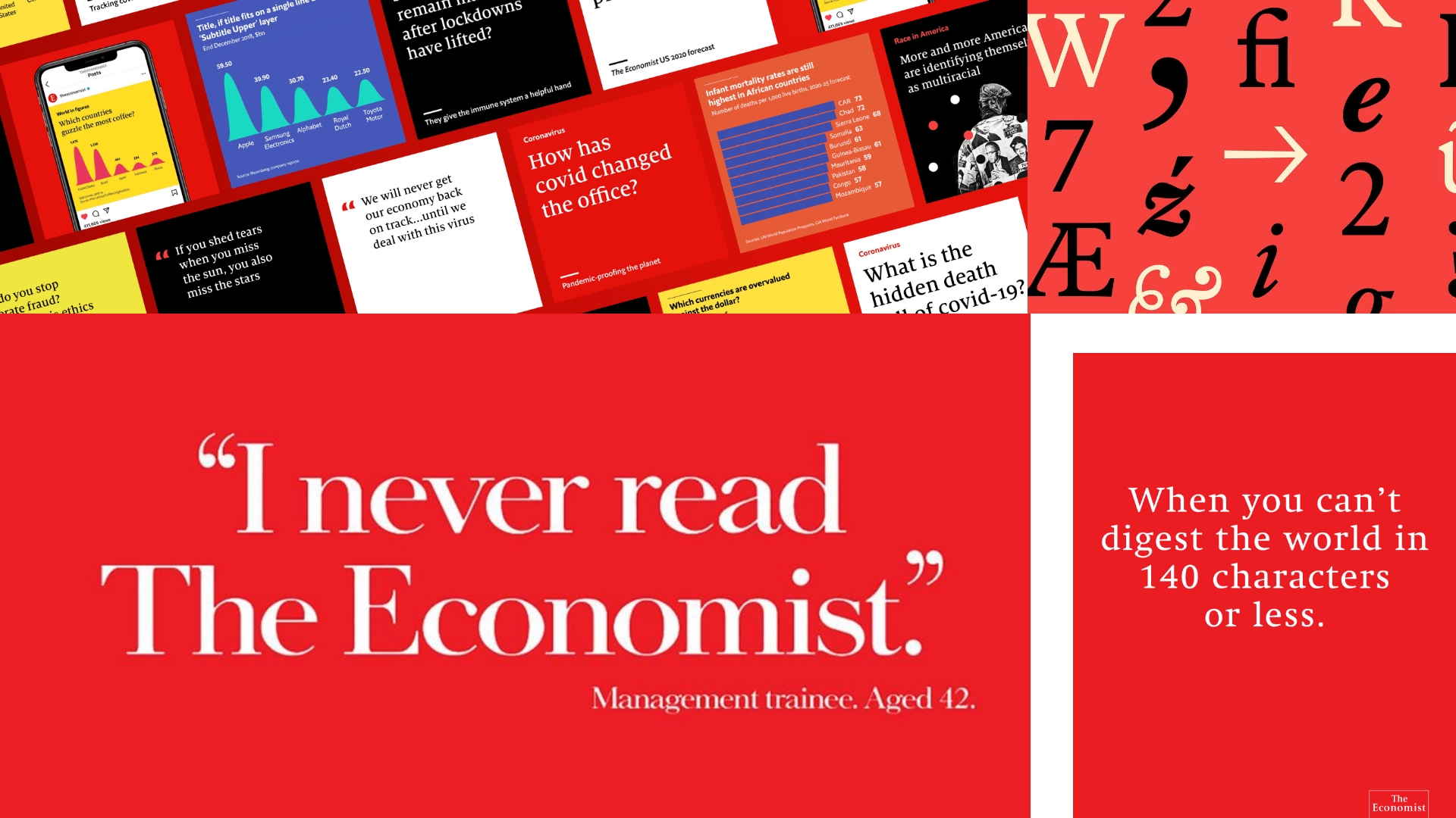
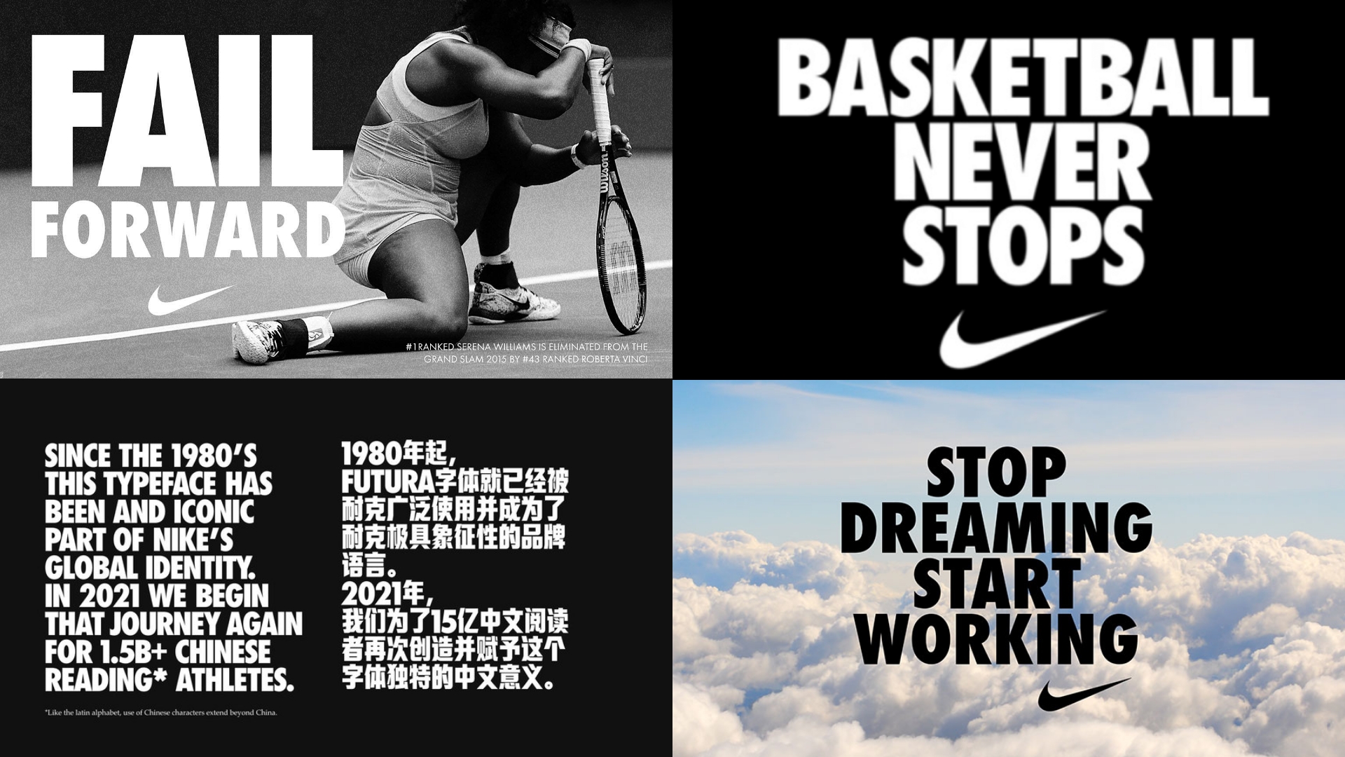
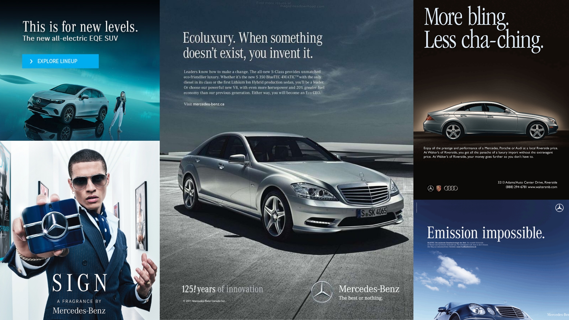
Typography as a driver of consistency and recognition
While logos serve as visual anchors, typography carries the daily workload of brand recognition. A brand’s type system appears in dozens of touchpoints: emails, marketing collateral, social media graphics, product interfaces, and internal documents. Over time, repeated exposure to consistent typography creates a visual pattern that audiences learn to recognize subconsciously.
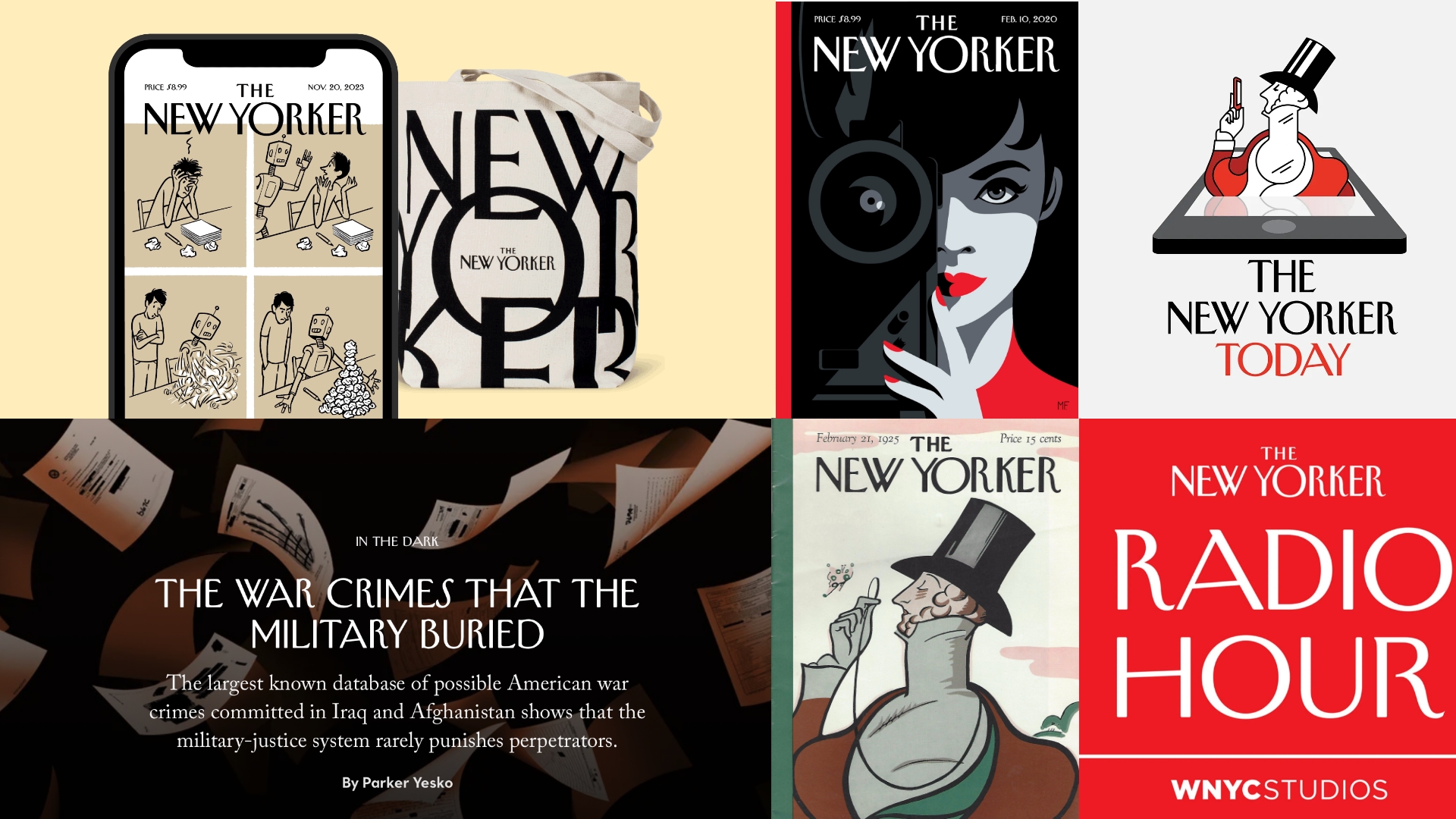
Many leading brands rely on this principle. Apple is known for its restrained, minimalist typographic discipline. The New York Times is defined by its historic blackletter masthead and classic serif voice. Airbnb’s typography reflects modern warmth, supporting its mission of belonging. In each case, typography is a clear differentiator that strengthens the brand’s identity across environments.
Consistency builds visual equity.
Inconsistent typography erodes it.
Without a defined system, teams default to personal preference, leading to mismatched fonts, uneven hierarchy, and unpredictable communication styles. This inconsistency weakens the brand’s authority and makes it harder for audiences to develop familiarity.
A typography system prevents this by establishing clear rules: which typefaces to use, how they should be paired, what sizes and weights are appropriate, and how hierarchy is constructed. It creates reliability, and reliability builds recognition.
Typography as a reflection of brand quality
Typography strongly influences how audiences perceive the quality of a brand. Attention to typographic detail signals professionalism and care. Neglecting typography communicates the opposite.
A premium brand using a poorly spaced typeface or inconsistent hierarchy creates an immediate disconnect. Similarly, an everyday brand can elevate its perceived value simply by adopting cleaner, more intentional typography. Type choices directly influence perceived cost, craftsmanship, and credibility.
In many cases, typography becomes a shortcut in the audience’s mind: If the typography is refined, the brand is trustworthy. If the typography is sloppy, the brand is careless.
This evaluation happens quickly and often unconsciously. Because typography is present in nearly every brand interaction, it has a cumulative effect. Each weak typographic moment chips away at trust. Each strong one reinforces it.
Typography as a foundation for user experience and accessibility
Accessibility is often framed in terms of colour contrast or alt text, but typography plays an equally critical role. Readability, legibility, and typographic structure directly impact whether a message is accessible to users with visual impairments, cognitive differences, or reading challenges. This includes:
- — Adequate type size
- — Balanced line height
- — Sufficient contrast
- — Consideration for dyslexia-friendly structures
- — Responsive adaptation across screen sizes
- — Avoidance of overly condensed or ornate letterforms in body text
Brands that invest in accessible typography not only improve usability but also demonstrate inclusivity and responsibility. This contributes to overall brand trust and expands the range of audiences who can comfortably engage with the brand’s content.
Typography as strategic infrastructure
When viewed collectively, typography becomes more than a design choice. It becomes strategic infrastructure. It underpins clarity, recognition, usability, and emotional resonance. It strengthens every layer of communication, both internal and external. It ensures that a brand’s visual and verbal identity speak in harmony.
Typography is not the hero of brand identity, but it is the system that allows the hero to function. Logos change. Campaigns rotate. Trends shift. But strong typography holds a brand together. It is the quiet constant that shapes how audiences perceive, understand, and connect with your brand, every single day.
Typography is the foundation of brand expression. Every word begins with form. Every form begins with typography.
2.0 —
What makes a typography system work
A typography system is more than a selection of fonts. It is a structured framework that governs how type behaves across all brand touch-points. It defines roles, hierarchy, spacing, styles, and visual rhythm. A strong typography system brings coherence to a brand, making communication clear, predictable, and scalable.
When teams operate without a typography system, inconsistencies multiply. Designers use different fonts. Marketers change hierarchy on the fly. Vendors interpret the brand differently. Over time, the brand begins to lose its visual discipline.
A typography system prevents this. It standardizes communication and ensures that every piece of content aligns with the brand’s identity.
The primary typeface: the brand’s dominant voice
The primary typeface defines the brand’s character. It appears in expressive, high-impact places such as headlines, key statements, and hero content. This typeface must reflect the brand’s personality and work well across large formats. A strong primary typeface should:
- — convey emotion
- — differentiate the brand
- — remain legible at various sizes
- — offer enough styles (weights, italics)
- — feel timeless rather than trendy
This is the brand’s visual voice. It must be chosen with intention.
The secondary typeface: structure and readability
Secondary typefaces support clarity, especially in long-form content. They appear in body text, captions, and detailed information. A good secondary typeface must:
- — be highly readable
- — scale well on mobile
- — pair harmoniously with the primary typeface
- — offer clarity without stealing attention
The harmony between primary and secondary type creates cohesion and hierarchy.
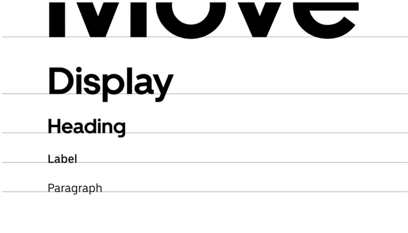
Hierarchy: the backbone of typographic clarity
Typography hierarchy organizes information so readers know what to read first, second, and third. It uses size, weight, spacing, and style to guide attention. Strong hierarchy:
- — reduces cognitive load
- — improves scannability
- — makes content feel structured and intentional
Without hierarchy, even the best message can be overlooked.

Weights and styles: nuance and emphasis
Weights (Light, Regular, Bold, Black) and styles (Italic, Small Caps, Condensed) allow designers to express tone and structure. They emphasize important content and de-emphasize supporting text. Too many weights cause clutter; too few limit expression. A balanced palette of weights ensures clarity and rhythm.
Spacing and alignment: the hidden architecture
Line height, letter spacing, paragraph spacing, and alignment shape readability and comfort. Good spacing is invisible, it simply makes content easy to consume. Poor spacing is immediately noticeable. This hidden architecture determines whether content feels dense, overwhelming, or effortless.
Typographic scale: consistent rhythm across formats
A typographic scale defines size relationships between headings, subheads, body text, and captions. It prevents designers from making arbitrary size decisions and ensures rhythm and consistency across materials. Scales create predictability, a hallmark of strong brand systems.
Responsive typography: adapting to every device
Typography must adjust to desktops, tablets, and mobile screens. Responsive rules ensure type remains legible, balanced, and structured regardless of screen size. A rigid typography system breaks easily; a responsive one ensures long-term usability.
Typographic devices: ownable visual cues
Custom numerals, unique quotation marks, signature dividers, editorial pull-quote styles, and specific layout structures add personality and make the brand instantly recognizable. These subtle touches elevate the system and create distinctiveness.
03 —
Choosing and testing type for real-world use
Designing a typography system begins with careful selection. While aesthetics play a role, choosing type for a brand is ultimately a strategic decision, one that must consider personality, functionality, scalability, licensing, accessibility, and technical performance across mediums. Typography does not live in a vacuum; it lives in real-world environments: websites, mobile screens, packaging, presentations, signage, social graphics, and brand collateral. The system must perform reliably and consistently across all of these contexts.
This part explores how to select the right typefaces and test them to ensure they support the brand’s voice, usability, and long-term growth.
Defining the role of typography within brand strategy
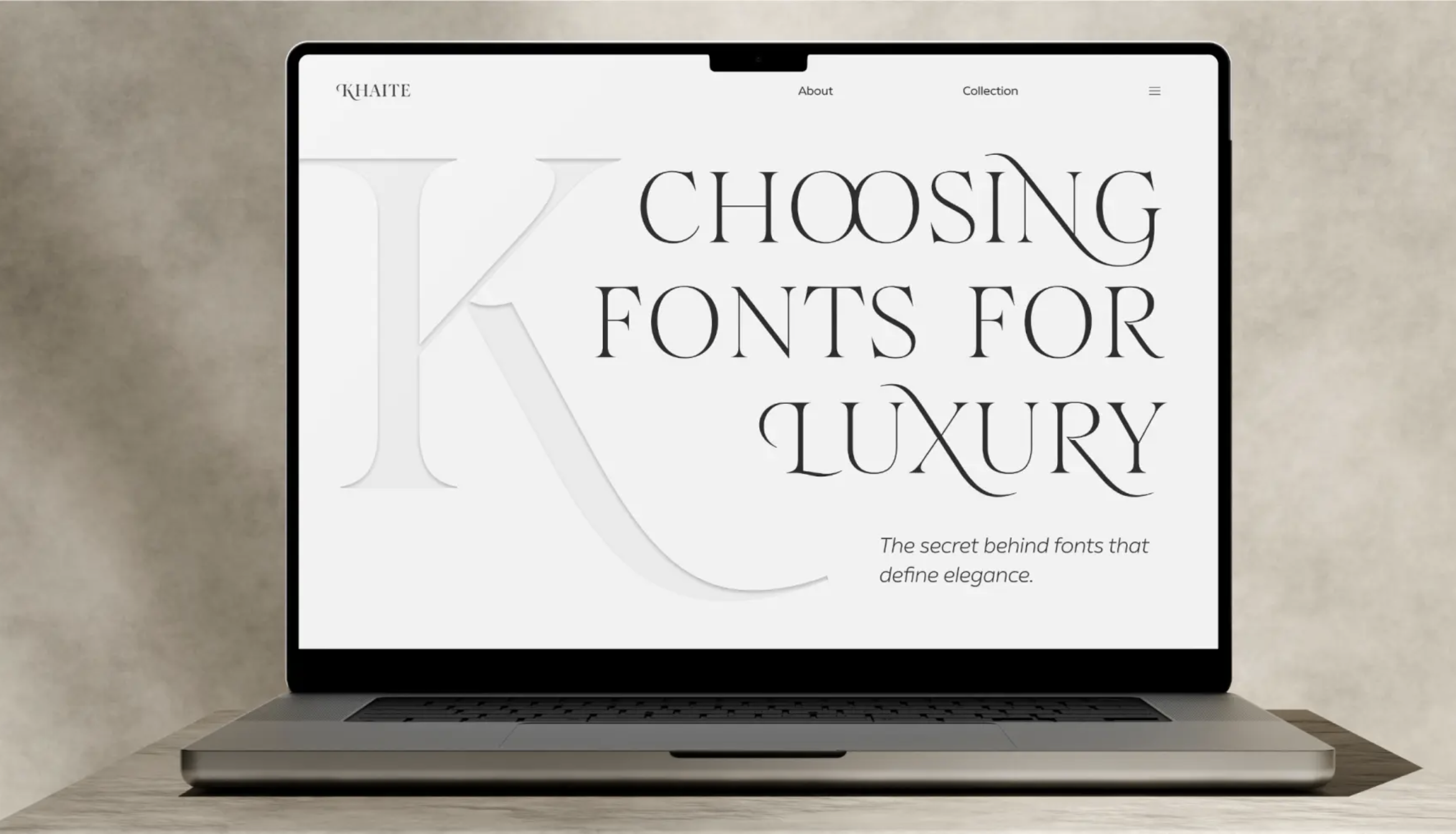
Before choosing typefaces, the brand must be understood clearly. Typography should reinforce the brand’s values, tone, and positioning. A technology startup aiming for clarity and innovation might prefer a geometric or humanist sans serif. A luxury brand leaning into heritage and craftsmanship may prefer a refined serif family. A lifestyle brand with expressive storytelling needs a type system with human warmth or editorial character.
Key questions include:
- — What emotional tone should the type convey?
- — Which audiences must the brand communicate with?
- — What industry norms exist, and where should we align or differentiate?
- — What mediums will carry the brand’s typography most often?
Typography must express personality while remaining versatile enough to support a wide range of content. Choosing typefaces without understanding the brand’s strategy leads to misalignment and inconsistent expression.
Evaluating typefaces for functionality and flexibility
A typeface must do more than look appropriate; it must perform well. The functional evaluation typically includes the following considerations:
1. Legibility and readability
Legibility refers to how easily individual characters can be distinguished. Readability refers to how comfortably a block of text can be processed.
For body copy, this is crucial.
A typeface may look beautiful at large sizes but become strained or illegible in paragraphs or small text on mobile screens. Fonts with overly tight apertures, extreme personality, or unusual character proportions can struggle in smaller contexts.
2. Range of weights and styles
A full type family should ideally include multiple weights (light, regular, medium, bold) and styles (italic, small caps). Limited type families reduce flexibility and can create monotony. Extensive families support nuanced hierarchy and allow designers to emphasize tone and structure with subtle shifts in weight.
3. Glyph support and language coverage
Global brands require typefaces that support multiple languages, including accented characters, non-Latin scripts, and specialized glyphs. Brands lacking full character coverage often face expensive redesigns when expanding into new markets.
4. Licensing and usage rights
Typography licensing varies widely, and misunderstandings can lead to legal complications or unexpected costs. Brands must consider:
- — desktop vs web licensing
- — app embedding
- — broadcast or commercial usage
- — internal vs external distribution of templates
High-quality commercial typefaces offer robustness, consistency, and professional support. Free fonts can be useful but often come with limitations in quality, consistency, or licensing.
5. Technical performance
Typefaces must render smoothly on diverse devices and browsers. Poor rendering can distort shapes, blur edges, or weaken brand perception.
Testing across major OS and browser combinations is essential before system-wide deployment.

Pairing typefaces with purpose
Pairing typefaces requires balance between similarity and contrast. The goal is to create harmony without redundancy, and distinction without conflict. There are several common pairing strategies:
1. Serif + Sans Serif
The most widely used combination. Serif for body text (warm, traditional); sans serif for headlines (clean, modern). This pairing brings structure and clarity.
2. Sans Serif + Sans Serif
Using two sans serif families with different expressions, for example, one geometric and one humanist, creates a modern, cohesive system with gentle tonal contrast.
3. Display + Functional
A highly expressive display typeface can enhance personality in large formats, while a clean sans or serif family handles body text and usability.
4. Single Family with Extensive Weights
Some brands use one superfamily with many weights and styles, creating unity and flexible hierarchy without introducing a second typeface.
Pairing is not about aesthetic preference alone. It must reinforce the brand’s tone and enhance legibility across all formats.
Stress-testing typography in real environments
Once a typeface or pair is shortlisted, testing becomes essential. Too often, brands select typefaces based on static samples or mood boards, not on real scenarios. A type system must prove itself under pressure.
Common stress tests include:
1. Long-form reading
How does body copy perform in paragraphs of 250–400 words? Is it comfortable, or does it fatigue the eye?
2. Small-size legibility
Does the type remain legible at 12 px, 10 px, or lower on mobile screens?
3. Headline impact
Does the type maintain strength, confidence, and clarity at large sizes?
4. UI scenarios
Buttons, labels, menus, and data tables often reveal weaknesses not visible in traditional layouts.
5. Dynamic environments
Motion graphics, animations, and responsive layouts require typefaces that adapt gracefully.
6. Accessibility audits
Testing contrast ratios, spacing, and letterform clarity ensures the system works for users with visual or cognitive challenges.
Real-world testing prevents future complications and ensures the typography system remains functional under all conditions.
Mockups and applications: Seeing type in context
No typography decision should be finalized without seeing it applied in context. Mockups bring type choices to life. They demonstrate how typography behaves in:
- — websites
- — social media posts
- — packaging
- — posters
- — product interfaces
- — pitch decks
- — signage or environmental graphics
These scenarios reveal whether the type aligns with the brand’s intended personality and whether it maintains visual coherence across formats.
Mockups often surface questions such as:
- Does the type feel too corporate for a lifestyle brand? Does it feel too soft for a technology brand? Does it hold its character in both small and large sizes? Does the hierarchy feel intuitive and clear?
Seeing typography applied often clarifies decisions that static samples cannot.
Ensuring long-term scalability
Typography systems must support the brand not only at launch but for years to come. Scalability includes:
- — potential expansion into new languages
- — increasing content volume
- — future digital platforms
- — internal templates for teams
- — collaborations with external agencies
A robust typography system becomes an asset that grows with the brand rather than a limitation that must be replaced.
Typography selection as a strategic investment
Ultimately, choosing typography is a strategic investment, not a stylistic preference. It shapes brand expression, affects usability, and influences perceived quality. A well-chosen type system becomes a long-term competitive advantage, elevating communication and reinforcing brand identity across all touch-points.
Typography decisions should be approached with the same rigour as any strategic brand choice. When done well, the typography system becomes a silent but powerful engine of clarity, cohesion, and credibility.
04 —
Why good typography pays off
Typography is one of the few branding elements that influence every single touchpoint of a brand. It is present in headlines, social posts, ads, interfaces, packaging, presentations, signage, and even internal documents. Because it appears everywhere, it has an outsized impact on how the brand is perceived, how effectively it communicates, and how consistently it is recognized. When typography is strong, the brand feels cohesive, confident, and clear. When it is weak, even the most compelling strategy or visual identity loses its impact.
Good typography is not a design luxury. It is a business advantage. It reduces friction, increases brand recognition, elevates perceived value, and strengthens trust. In this final part, we explore why investing in high-quality typography pays off not only creatively but strategically and financially.
Typography strengthens brand consistency across all touch-points
Consistency is one of the most powerful tools in branding. Repetition builds memory, and memory builds recognition. Typography plays a central role in that process because it shows up more often than the logo, color palette, or graphic devices. The typography system becomes the connective tissue across all communication.
When a brand uses typography inconsistently — mixing typefaces, altering hierarchy, or changing spacing arbitrarily — the brand feels unstable and unprofessional. The message may be strong, but the visual delivery weakens it. Audiences struggle to develop familiarity.
Strong typography systems prevent this by:
- — defining clear rules for usage
- — establishing hierarchy for clarity
- — providing templates for teams
- — minimizing personal interpretation
- — enabling brand-wide alignment
As teams grow and content volume increases, consistency becomes harder to maintain. A well-defined typography system acts as a guardrail, keeping the brand coherent across departments, agencies, and partners.
Consistency also creates efficiency. When everyone uses the same system, there is less revision, less confusion, and fewer off-brand materials. Typography becomes a quality control mechanism that protects the brand’s identity.
Typography enhances perceived value and professionalism
Typography directly influences how premium or credible a brand feels. A refined, well-spaced, well-chosen type system communicates intention and expertise. It shows the brand cares about details. And when audiences see that level of care, they infer quality across the entire experience.
This phenomenon is well documented in design psychology: people judge the content by the container. A message written in a poorly chosen typeface looks less trustworthy than the same message expressed with professional typography.
Premium brands understand this. They rely on typography to signal:
- — craftsmanship
- — authority
- — sophistication
- — exclusivity
- — attention to detail
Typography is often the first indicator of whether a brand feels high-value or generic. Even a simple brand can elevate its entire presence through thoughtful typography. Conversely, a brand with a sophisticated offer can diminish its perceived value with imprecise or inconsistent type.
Investing in typography is a way to elevate the entire brand without redesigning the logo or graphics. It is one of the most powerful levers of perceived value.
Typography improves communication clarity and user experience
At its core, typography is about communication. It organizes information, enables comprehension, and reduces cognitive effort for the reader. Good typography creates visual order. It ensures that the reader understands what matters most, what supports it, and how to navigate the content smoothly.
Clarity in communication leads to better engagement. Users stay longer, read more, and understand the message more easily. On the other hand, poor typography increases friction — especially in digital environments where attention spans are limited.
Brands benefit from typography through:
- — improved legibility across devices
- — clear content hierarchy
- — intuitive scanning patterns
- — comfortable reading rhythm
- — accessible design for diverse audiences
When users understand your content effortlessly, your message lands. When they struggle, the message is lost, regardless of its quality.
Typography is not decoration. It is the infrastructure of communication. Good typography ensures that this infrastructure is strong, stable, and user-friendly.
Typography reduces design and production costs over time
One of the often overlooked benefits of a typography system is operational efficiency. When teams lack a clear system, they spend significant time making basic decisions: which font to use, how large text should be, how to format subheads, how much spacing is needed, and more. Every project becomes a reinvention.
A well-defined typography system eliminates unnecessary decision-making. It speeds up design, reduces revisions, and minimizes inconsistencies. Designers can work faster. Marketers can produce content more confidently. Teams can collaborate without ambiguity.
Typography acts as a design framework that reduces:
- — time spent on formatting
- — rounds of feedback
- — inconsistencies across materials
- — dependency on senior designers
Over time, this efficiency leads to measurable cost savings. Brands produce more content with fewer errors. Campaigns launch faster. Internal documents remain polished without additional design intervention.
Typography is not just a creative asset; it is an operational one.
Typography supports brand scalability and future growth
As brands evolve, they must adapt to new mediums, audiences, markets, and technologies. Typography is the backbone that allows this evolution without losing identity. A well-designed system can scale across:
- — new languages
- — new digital platforms
- — new content types
- — new product lines
- — global campaigns
Brands that outgrow their typography systems often face costly redesigns or patchwork fixes to accommodate new needs. A robust system anticipates expansion. It includes language support, responsive behaviors, and enough variation to handle diverse expressions.
Scalability is not about having many fonts; it is about having the right ones, structured in a way that supports long-term growth.
Typography builds long-term brand equity
Brand equity is built through meaningful, repeated experiences. Typography contributes to this by creating visual memory. When audiences consistently encounter the same typographic style across multiple touch-points, the association becomes stronger. Typography becomes part of the brand’s identity, even without conscious recognition.
This is why many iconic brands rarely change their type systems. The typography becomes synonymous with the brand itself. It carries years of association, familiarity, and trust.
Good typography compounds in value over time. Each consistent application strengthens recognition. Each clear communication reinforces credibility. Each polished piece of content enhances perceived quality.
Typography becomes an asset that grows, protects, and amplifies brand equity.
Typography pays off because it shapes perception at every level
Typography influences emotion, comprehension, trust, recognition, usability, and perceived value. It shapes the brand experience in subtle but powerful ways. When done well, typography becomes the foundation of a strong visual identity — one that elevates every piece of communication.
Brands that invest in typography invest in clarity, consistency, and long-term resonance. It is not simply a design choice. It is a strategic decision with lasting impact.
Typography pays off because it is always working.
Quietly. Constantly. Across every medium and every moment.
Typography is not decoration. It is direction
Typography is one of the most powerful, cost-effective, and strategically valuable tools in branding. It shapes perception, clarifies communication, aligns teams, and strengthens recognition. A brand that invests in typography is a brand that invests in clarity, cohesion, and long-term resonance.
While a logo may introduce the brand, typography sustains it. It carries the brand’s voice across every medium and every moment. Thoughtful typography transforms words into experiences, messages into meaning, and brands into identities that endure.
If this article made you think about your own brand, that's worth a conversation.
Book a Free Vision Clarity Session →


