Choosing typefaces is a strategic decision, not a stylistic one. Start with the brand's personality and audience. Check each candidate for legibility, weights, language coverage, licensing, and technical performance. Pair with purpose, then test in real environments before you commit.
Choosing typefaces is where a typography system starts. This article is the second half of Brand typography: the voice you can see (link to the first article), which covers why type matters and what a typography system includes. Here we cover how to select the right typefaces and test them before you commit.
Designing a typography system begins with careful selection. While aesthetics play a role, choosing type for a brand is ultimately a strategic decision, one that must consider personality, functionality, scalability, licensing, accessibility, and technical performance across mediums.

Defining the role of typography within brand strategy
Before choosing typefaces, the brand must be understood clearly. Typography should reinforce the brand's values, tone, and positioning. A technology startup aiming for clarity and innovation might prefer a geometric or humanist sans serif. A luxury brand leaning into heritage and craftsmanship may prefer a refined serif family. A lifestyle brand with expressive storytelling needs a type system with human warmth or editorial character. For what each style signals, see the guide in Brand typography: the voice you can see (link).
Key questions include:
- Is the brand modern or traditional, playful or serious, luxurious or accessible?
- What emotional tone should the type convey?
- Which audiences must the brand communicate with? Typefaces can carry different connotations in different cultures, so check how yours reads for each audience.
- What industry norms exist, and where should we align or differentiate?
- What mediums will carry the brand's typography most often?
Typography must express personality while remaining versatile enough to support a wide range of content. Choosing typefaces without understanding the brand's strategy leads to misalignment and inconsistent expression.
Evaluating typefaces for functionality and flexibility
A typeface must do more than look appropriate. It must perform well. The functional evaluation typically includes the following considerations:
1. Legibility and readability
Legibility refers to how easily individual characters can be distinguished. Readability refers to how comfortably a block of text can be processed. For body copy, this is crucial.
A typeface may look beautiful at large sizes but become strained or illegible in paragraphs or small text on mobile screens. Fonts with overly tight apertures, extreme personality, or unusual character proportions can struggle in smaller contexts.
2. Range of weights and styles
A full type family should ideally include multiple weights (light, regular, medium, bold) and styles (italic, small caps). Limited type families reduce flexibility and can create monotony. Extensive families support nuanced hierarchy and allow designers to emphasize tone and structure with subtle shifts in weight.
3. Glyph support and language coverage
Global brands require typefaces that support multiple languages, including accented characters, non-Latin scripts, and specialized glyphs. Brands lacking full character coverage often face expensive redesigns when expanding into new markets.
4. Licensing and usage rights
Typography licensing varies widely, and misunderstandings can lead to legal complications or unexpected costs. Brands must consider:
- Desktop vs web licensing
- App embedding
- Broadcast or commercial usage
- Internal vs external distribution of templates
High-quality commercial typefaces offer robustness, consistency, and professional support. Free fonts can be useful but often come with limitations in quality, consistency, or licensing.
5. Technical performance
Typefaces must render smoothly on diverse devices and browsers. Poor rendering can distort shapes, blur edges, or weaken brand perception.
Testing across major OS and browser combinations is essential before system-wide deployment.
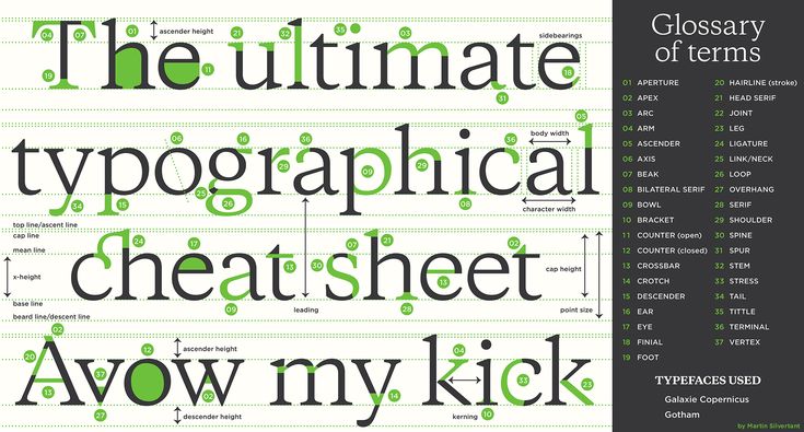
When a custom typeface is worth it
A custom typeface is designed for one brand, so no one else has the same look. It's worth considering when the market is crowded and differentiation is hard, or when no existing family matches the brand's personality. It can be tailored to convey luxury, playfulness, or innovation, and it gives every touchpoint, from website to packaging, the same unmistakable voice.

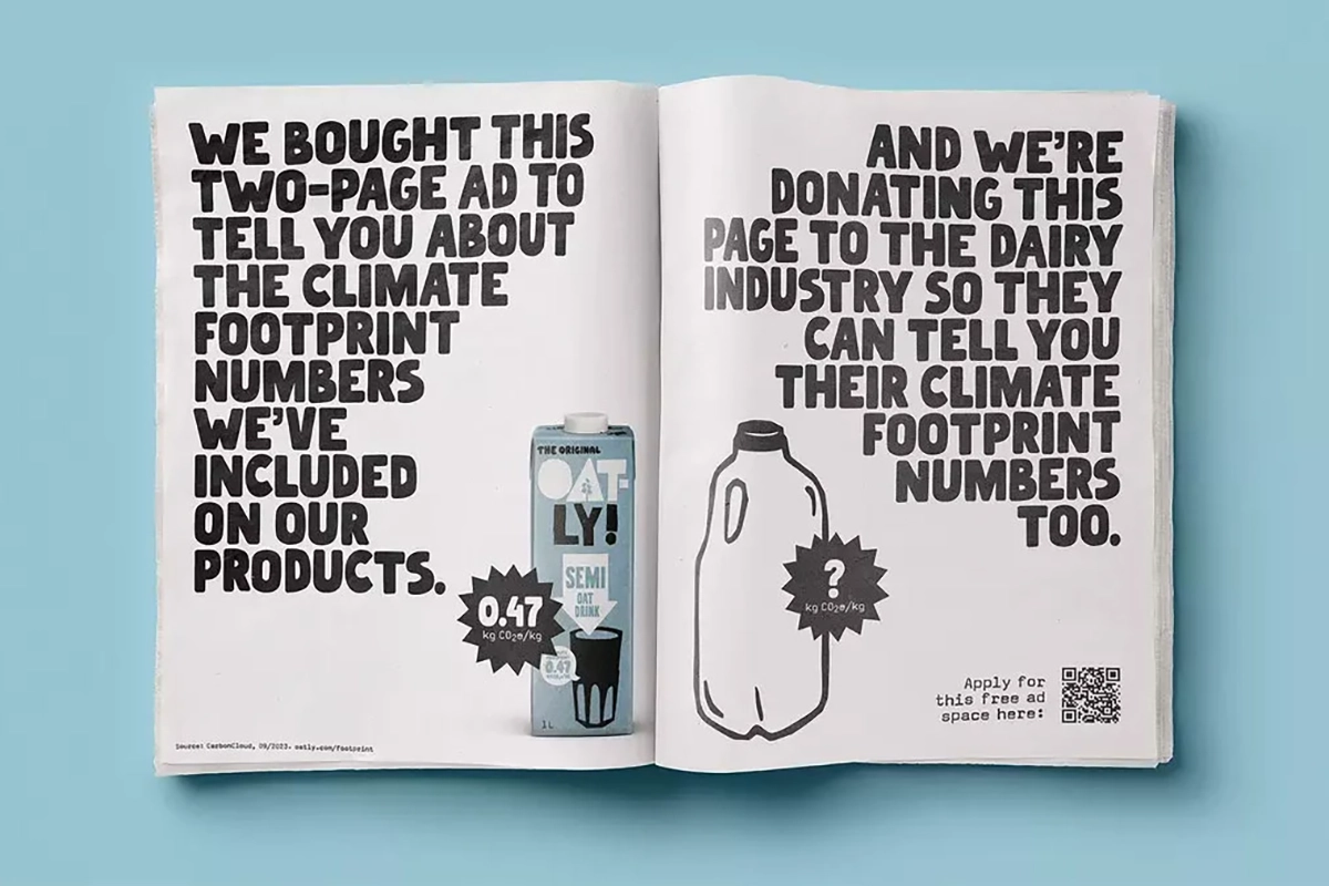
The New Yorker's custom type, inspired by classic serifs, carries the magazine's literary heritage. Oatly's bold, hand-drawn lettering carries its playful, rebellious persona. The trade-off is cost and time, and a custom typeface still needs the same weights, language coverage, and licensing checks as any other.
Pairing typefaces with purpose
Pairing typefaces requires balance between similarity and contrast. The goal is to create harmony without redundancy, and distinction without conflict. There are several common pairing strategies:
1. Serif + sans serif
The most widely used combination. Serif for body text (warm, traditional), sans serif for headlines (clean, modern). This pairing brings structure and clarity.
2. Sans serif + sans serif
Using two sans serif families with different expressions, for example one geometric and one humanist, creates a modern, cohesive system with gentle tonal contrast.
3. Display + functional
A highly expressive display typeface can enhance personality in large formats, while a clean sans or serif family handles body text and usability.
4. Single family with extensive weights
Some brands use one superfamily with many weights and styles, creating unity and flexible hierarchy without introducing a second typeface.
Pairing is not about aesthetic preference alone. It must reinforce the brand's tone and enhance legibility across all formats.
Stress-testing typography in real environments
Once a typeface or pair is shortlisted, testing becomes essential. Too often, brands select typefaces based on static samples or mood boards, not on real scenarios. A type system must prove itself under pressure.
Common stress tests include:
1. Long-form reading
How does body copy perform in paragraphs of 250 to 400 words? Is it comfortable, or does it fatigue the eye?
2. Small-size legibility
Does the type remain legible at 12 px, 10 px, or lower on mobile screens?
3. Headline impact
Does the type maintain strength, confidence, and clarity at large sizes?
4. UI scenarios
Buttons, labels, menus, and data tables often reveal weaknesses not visible in traditional layouts.
5. Dynamic environments
Motion graphics, animations, and responsive layouts require typefaces that adapt gracefully.
6. Accessibility audits
Testing contrast ratios, spacing, and letterform clarity ensures the system works for users with visual or cognitive challenges.
Finish with mockups. Seeing the type applied to a website, a package, or a pitch deck settles questions static samples can't: does it feel too corporate for a lifestyle brand, or too soft for a technology brand?
Real-world testing prevents future complications and ensures the typography system remains functional under all conditions.
Ensuring long-term scalability
Typography systems must support the brand not only at launch but for years to come.
Scalability includes:
- — Potential expansion into new languages
- — Increasing content volume
- — Future digital platforms
- Internal templates for teams
- Collaborations with external agencies
A robust typography system becomes an asset that grows with the brand rather than a limitation that must be replaced.
Choose from the strategy, then test
Pick type from the brand's personality and audience, check each candidate against real use, and test before you commit. Do that, and the typography system holds up as the brand grows. For the system that governs the typefaces once they're chosen, read Brand typography: the voice you can see.
If this made you think about your own brand, let’s talk.
Book a free 15-minute discovery call