Logo: The mark of meaning
Most businesses treat their logo as the start of branding when it’s actually the result. A great logo doesn’t create meaning, it captures it. From Apple’s bite to Nike’s swoosh, powerful logos distill strategy into simplicity, emotion, and trust. When built on clarity and consistency—not trends—they become symbols of belief, not decoration.
01. Brands build logos
If you’re building a business, sooner or later you’ll face the question: “When are we getting our logo done?” It’s a fair question. A logo feels tangible, something you can show, print, share, or stick on your website. But most businesses make a quiet mistake right here: they treat the logo as a starting point, when it’s actually a summary.
A logo doesn’t build a brand.
A brand builds a logo.
Your logo is the punctuation mark at the end of your strategy sentence, the distillation of everything you believe, promise, and deliver.
Brands build logos
Think about the world’s most recognizable marks: the bitten Apple, the Nike Swoosh, the Golden Arches, the twin-tailed mermaid. Each looks deceptively simple, yet simplicity is never the starting point. It’s the result of deep clarity about what the brand stands for.
Simplicity is the ultimate sophistication
— Leonardo da Vinci
When Apple approved its now-iconic logo in 1977, it wasn’t about a pretty symbol. Designer Rob Janoff created something radically human at a time when computers looked cold and mechanical. The bite gave it character and scale; the apple itself represented curiosity and creativity. Jobs saw it as a perfect expression of what Apple would become, technology made friendly, personal, and approachable.

A few years earlier, Nike’s now-famous Swoosh was born from a similar truth. Carolyn Davidson didn’t just draw a curve, she captured motion, momentum, and myth. The mark was inspired by the wings of Nike, the Greek goddess of victory, a symbol of speed, triumph, and the power to rise above. That single stroke wasn’t decoration; it was a declaration. Over time, it evolved into an emblem of ambition in motion, the feeling of pushing past limits and chasing greatness.

Both marks worked not because of their shapes, but because of the ideas they carried. Logos like these are visual shortcuts for belief systems. They condense purpose into a single glance. Before you commission your next redesign, step back and ask yourself:
- — What story should our logo summarize?
- — What belief are we putting a symbol to?
- — If someone knew nothing about us, what should this mark whisper first?
Until those questions are answered, design remains decoration. Once they are, design becomes direction.
Minimum Viable Brand: The System Behind This Article
This article sits within the Minimum Viable Brand (MVB) framework, a system designed to help brands establish clarity early and maintain coherence as they grow. The full MVB overview explains how strategy and identity work together as a single operating system.
Read the full Minimum Viable Brand overview and explore the complete series →
02. The job description of a logo
A logo actually has a measurable job to do, and it’s more serious than “looking good.”
01 Recognition
It helps people identify your brand instantly, even from a distance or a scroll. Think of the FedEx word mark: a simple sans serif, yet the hidden arrow between the E and X subtly conveys speed and precision. You don’t need to read the name twice to know what they stand for.

02 Meaning
It cues a deeper association. The World Wildlife Fund’s panda is not random; it embodies care for endangered life. One look, and your brain connects compassion, conservation, and trustworthiness.

03 Consistency
It becomes a signature you can repeat across every touchpoint, packaging, uniforms, vehicles, app icons, ensuring people see a single, unified face wherever they meet you.
When your logo performs those three roles, it becomes less an image and more an interface between business and belief.
Why “looking good” isn’t enough
Let’s talk about the temptation every entrepreneur faces. You see your competitor’s new logo, fresh gradient, maybe even a swoosh-style motion effect, and you think: “We need something that looks modern like that.” But chasing trends is like repainting a house that still has structural cracks. A “good-looking” logo without meaning might win likes, but it won’t win loyalty.
In an effort to look global and dynamic, Kraft ditched its heritage blue-and-red logo for a colourful burst of dots and a curved smile. It looked friendly, but it meant nothing. Customers didn’t associate it with trust, quality, or history. Within months, Kraft quietly returned to a simplified version of its original design.
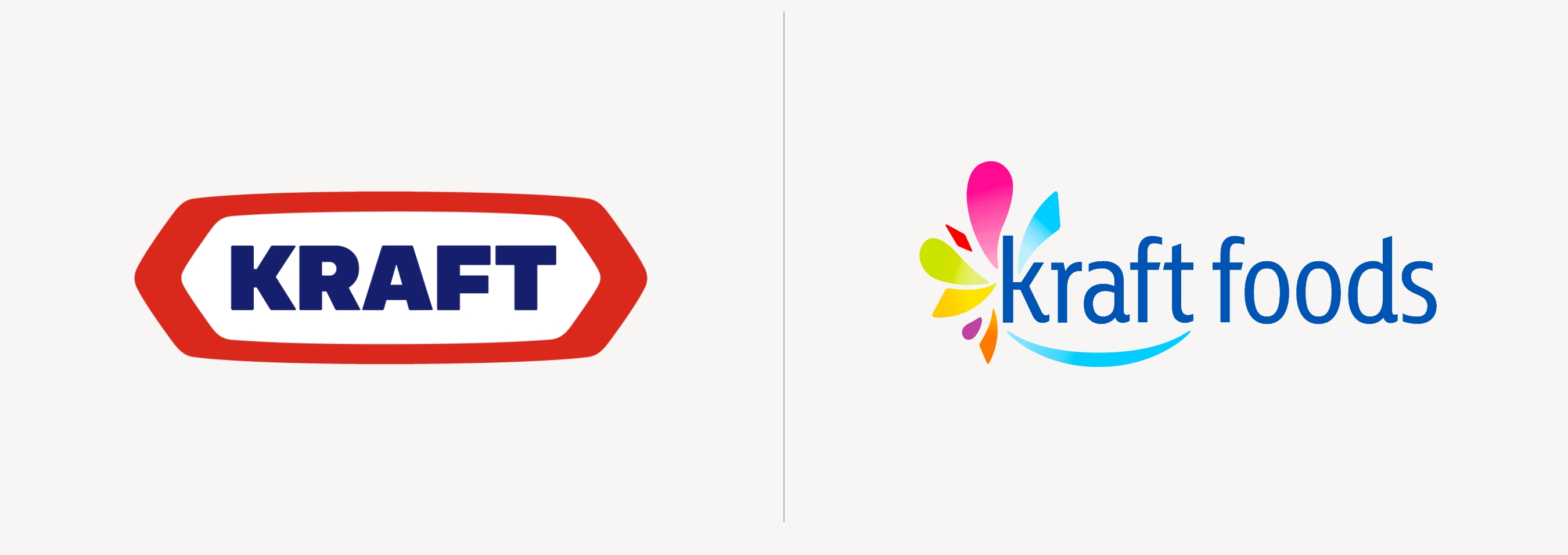
Why? Because people don’t fall in love with graphics; they fall in love with recognition. A beautiful logo without strategy is just an expensive sticker.
Run the one-sentence test on your own logo right now.
"Our logo stands for _____, so that customers instantly feel _____."
If you hesitated — if you couldn't fill that in without a paragraph of explanation — your logo is carrying weight it wasn't designed to carry. That's not a design problem. It's a strategy problem.
A Vision Clarity Session is where we work out what your logo should stand for before anything gets redesigned.
Book a Free Vision Clarity Session →
03. The three layers of logo meaning
When we build logos inside the Smart Brand Builder process, we think of meaning in three layers — each one deeper than the last.
Layer 1: The Literal
What does the mark depict? A leaf, a letterform, a wave, a shield. Literal shapes are fine, they anchor memory. But alone, they’re generic.
Layer 2: The Conceptual
What’s the metaphor behind it? The arrow in Amazon’s logo (from A to Z) signals range and satisfaction. The bite in Apple isn’t about fruit; it’s a human-scale detail, the interface between curiosity and clarity.
Layer 3: The Emotional
What feeling should it trigger? Excitement, security, belonging, pride, calm? This is the real engine of brand recognition.
Harley-Davidson’s emblem isn’t about motorcycles — it’s about freedom.
The Mastercard circles aren’t about payment — they’re about connection.
When your logo layers meaning from literal → conceptual → emotional, it moves from “nice” to necessary.
The Hidden ROI of a Good Logo
Entrepreneurs often ask, “Can a logo really affect sales?” Not directly. But it dramatically affects trust, and trust affects everything. A logo that looks professional and consistent signals reliability. And reliability reduces risk in the customer’s mind. It’s the same reason why investors prefer startups with polished decks and cohesive branding — it implies discipline and long-term vision. Design clarity = business confidence.
Consider this: in 2022, Lucid press found that consistent branding across all channels can increase revenue by up to 23 %.
A logo is the anchor of that consistency. Every invoice, email signature, and social thumbnail is a small brand rehearsal.The more you repeat your logo with purpose, the faster it compounds into trust equity.
04. Building meaning through behaviour
Common logo mistakes (and what to do instead)
01: Designing Before Deciding
Jumping into visuals before defining purpose.Too many founders start with mood boards and Behance references before they’ve answered why they exist or what makes them different. The result? A logo that looks nice but says nothing. Without strategy, design becomes guesswork — pretty, but powerless.
→ Fix: Clarify your Only-ness Statement first
Ask yourself, what makes your brand truly unique and valuable? When you know that, design becomes expression, not exploration. A designer can’t draw clarity you don’t yet have.
02: Over-Complication
It’s tempting to pack your story, initials, product, and purpose into one shape, like forcing a novel into a single sentence. But complexity kills recall. The human brain remembers what it can recognize instantly. Think of Apple, Nike, or Shell, none of them try to explain themselves in the logo; they evoke something bigger.
→ Fix: Focus on one core idea.
Ask, “If our logo had to whisper just one truth about us, what would it be?” Then remove everything that doesn’t serve that idea. If your logo needs a paragraph of explanation, it’s doing too much.
03: Inconsistency in Use
Different colours, stretched proportions, alternate fonts. This happens when every vendor, employee, or marketing intern tweaks the logo to “fit” a format. Soon, your identity looks like a collage of cousins — related, but not identical. Inconsistency erodes trust. If your visuals keep changing, people subconsciously assume your business might too.
→ Fix: Create a Minimum Viable Brand guideline.
even a one-page PDF that defines your logo sizes, spacing, colours, and don’ts. Protecting consistency doesn’t make creativity rigid; it makes recognition possible.
04: Following Trends Blindly
Many brands chase aesthetics instead of alignment. You see a new minimalist logo on Dribbble and want yours to look “fresh” too. But trends age fast, what’s fashionable today can look dated tomorrow. Remember the wave of 2010s rebrands that stripped away every ounce of character in the name of “simplicity”?
→ Fix: Build for longevity. Not likes.
Anchor your design in timeless principles, proportion, balance, clarity, and in your own story. Ask, “Will this still feel relevant five or ten years from now?” If yes, you’ve built equity instead of ephemerality.
05: Ignoring Versatility
A logo that only works on your website but not on a product, profile picture, or embroidery.In today’s fragmented world, your mark needs to perform across 50+ touch points, from tiny app icons to large billboards, from dark mode to print. Logos that rely on complex gradients or ultra-thin lines often break down in real life.
→ Fix: Stress-test your logo.
Print it small. Flip it to black and white. Put it on a t-shirt, favicon, and social avatar. See if it still feels strong, simple, and clear. The best logos are chameleons, consistent in meaning, adaptable in form. Your logo is a living asset, treat it like one.
The Small-Business Advantage
Here’s some good news: small businesses can build meaning faster than big ones. Corporations need years of media spend to attach emotion to a mark. You, as a founder, have something more powerful, proximity. Every time you deliver a great product, reply personally to a customer, or live your brand values, your logo gains credibility.
For local brands, this compounding happens fast. Think of your community café, plumber, or gym. Their logo might be simple, even imperfect, yet people associate it with reliability, warmth, or trust. Meaning, once earned, beats design perfection every time. So don’t wait for scale to define meaning. Build it through behaviour from day one
A practical exercise: The one-sentence test
Take a moment with your team and answer this: “Our logo stands for _____, so that customers instantly feel _____.”
If you can fill that sentence in under ten seconds, congratulations, your logo has clarity. If not, you’ve uncovered a strategic blind spot worth fixing. That single sentence becomes the creative brief for every future design decision.
What a great logo feels like
A strong logo feels like a handshake — firm, familiar, and intentional. It tells people: “You can trust me. I know who I am.” That’s why the world doesn’t need another “cool” logo; it needs more honest ones. Ones that speak from purpose, not Pinterest. Design agencies can execute; but you, the founder, must supply the meaning. That’s the partnership that builds brands that last.
The mark of meaning
At its core, a logo is a promise in miniature. It’s the smallest, simplest artifact of your entire belief system. So treat it with the seriousness of a signature, because that’s exactly what it is. Smart logos aren’t about clever shapes. They’re about clear ideas. They encode the essence of what your brand stands for and give every future decision a compass to follow.
When your logo carries meaning, every other element of your design, colour, type, layout, motion, suddenly aligns. That’s when your brand starts to feel inevitable. Because in branding, clarity always wins over complexity. And meaning always outlasts style.
Next in the PunchThatDesign™ Series:
Part 2 — “The Psychology of Palette”
How colour builds emotion, recall, and recognition faster than words ever can.
If this article made you think about your own brand, that's worth a conversation.
Book a Free Vision Clarity Session →


